GoTipMe
Overview
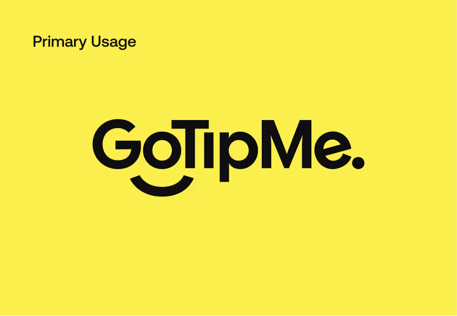
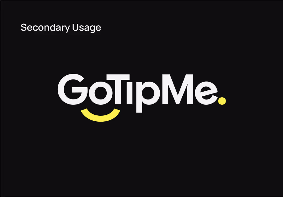
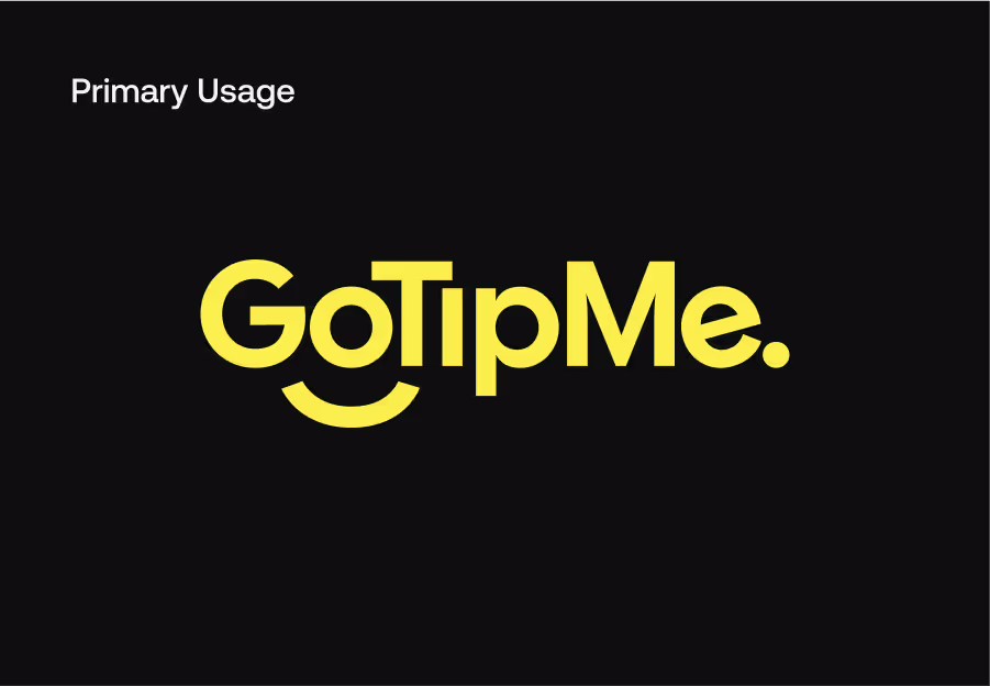
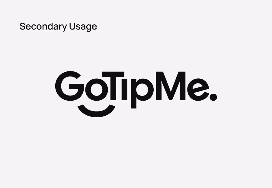
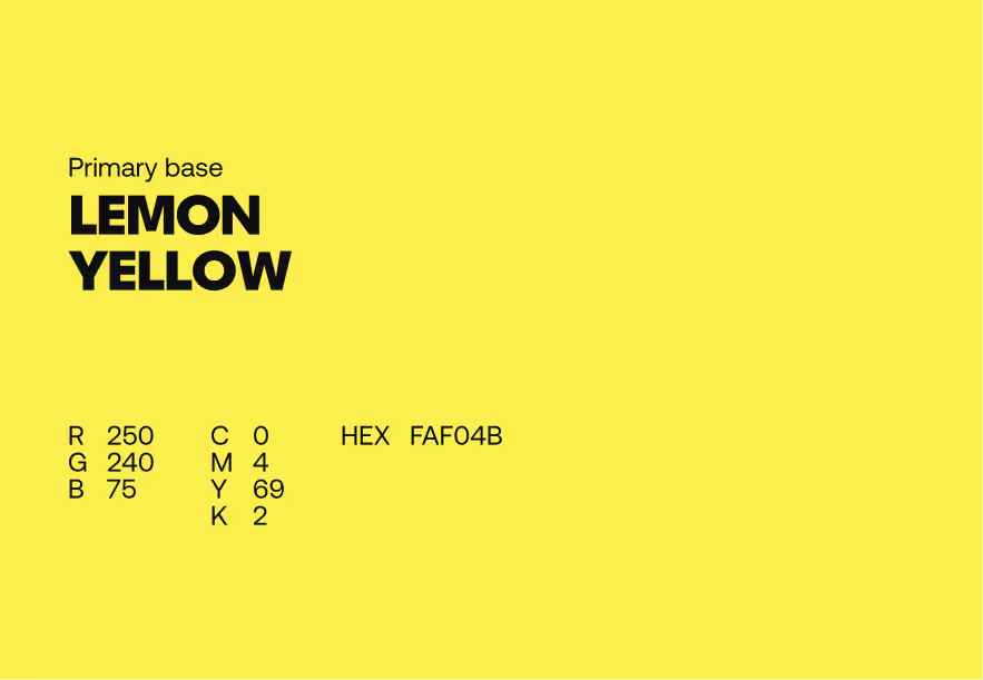
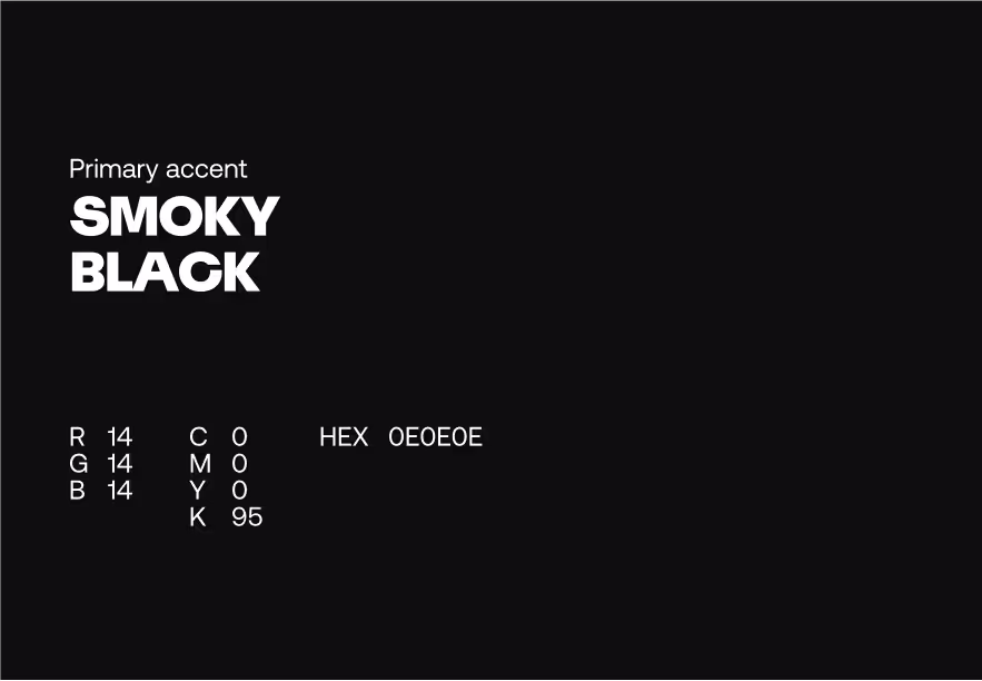
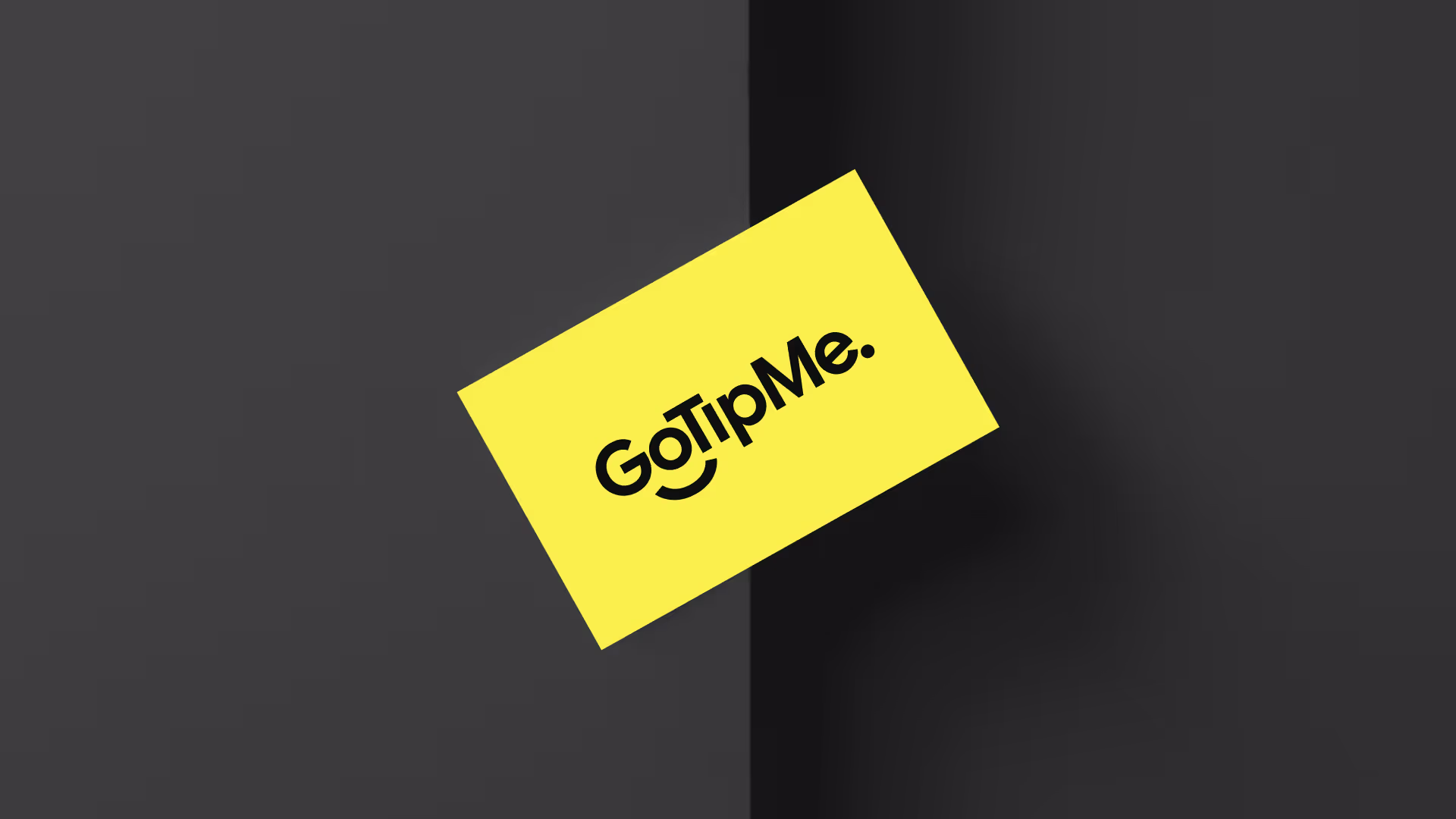
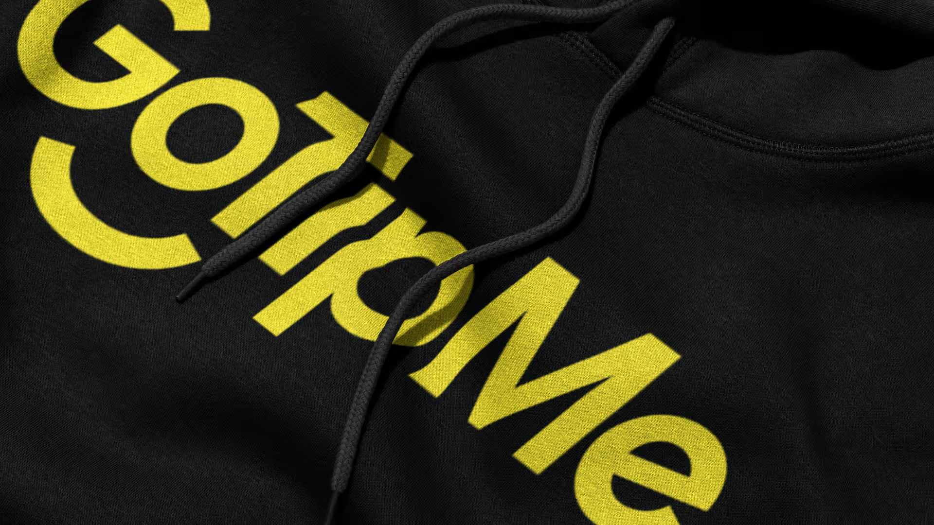
The wordmark is the face of GoTipMe — the primary visual expression we use to identify ourselves. This is why we need to be careful to use it correctly. Please ensure that the following brand guidelines are respected to maintain brand consistency Primarily the wordmark should be displayed in Smoky Black on a Lemon Yellow background or in inverted order, Lemon Yellow on a Smoky Black background. Cultured White with Lemon Yellow accents on a Smoky Black background and Smoky Black on a Cultured White background are also available if needed.
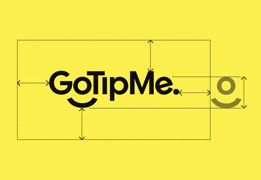
Wordmark
The wordmark is the face of GoTipMe — the primary visual expression we use to identify ourselves. This is why we need to be careful to use it correctly. Please ensure that the following brand guidelines are respected to maintain brand consistency Primarily the wordmark should be displayed in Smoky Black on a Lemon Yellow background or in inverted order, Lemon Yellow on a Smoky Black background. Cultured White with Lemon Yellow accents on a Smoky Black background and Smoky Black on a Cultured White background are also available if needed.
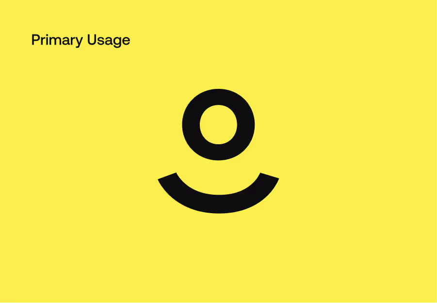
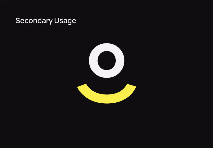
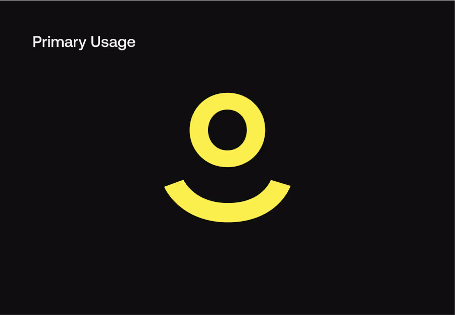
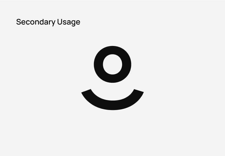
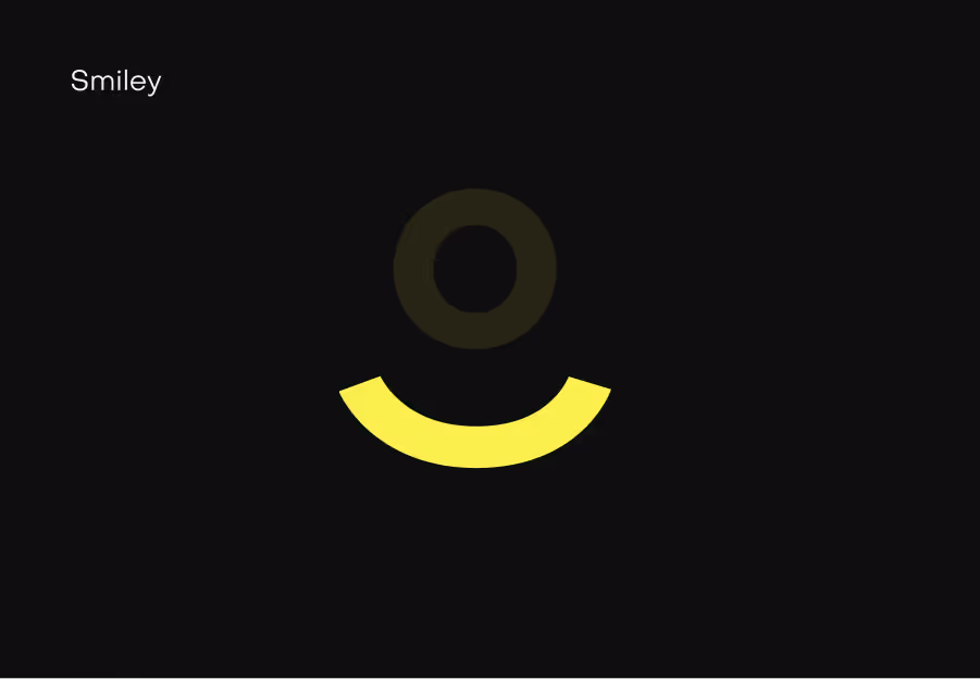
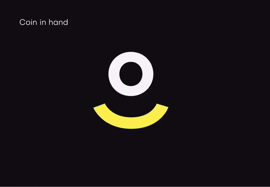
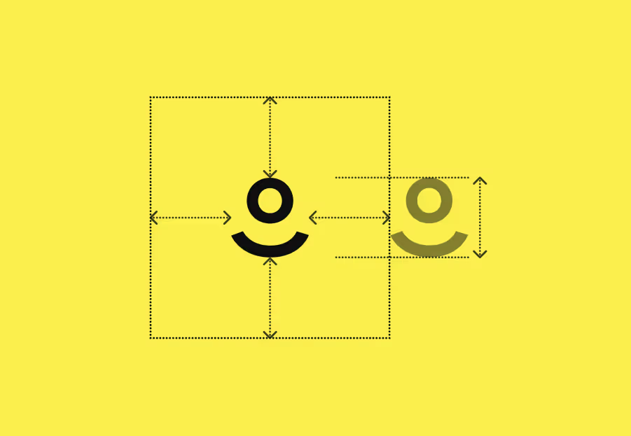
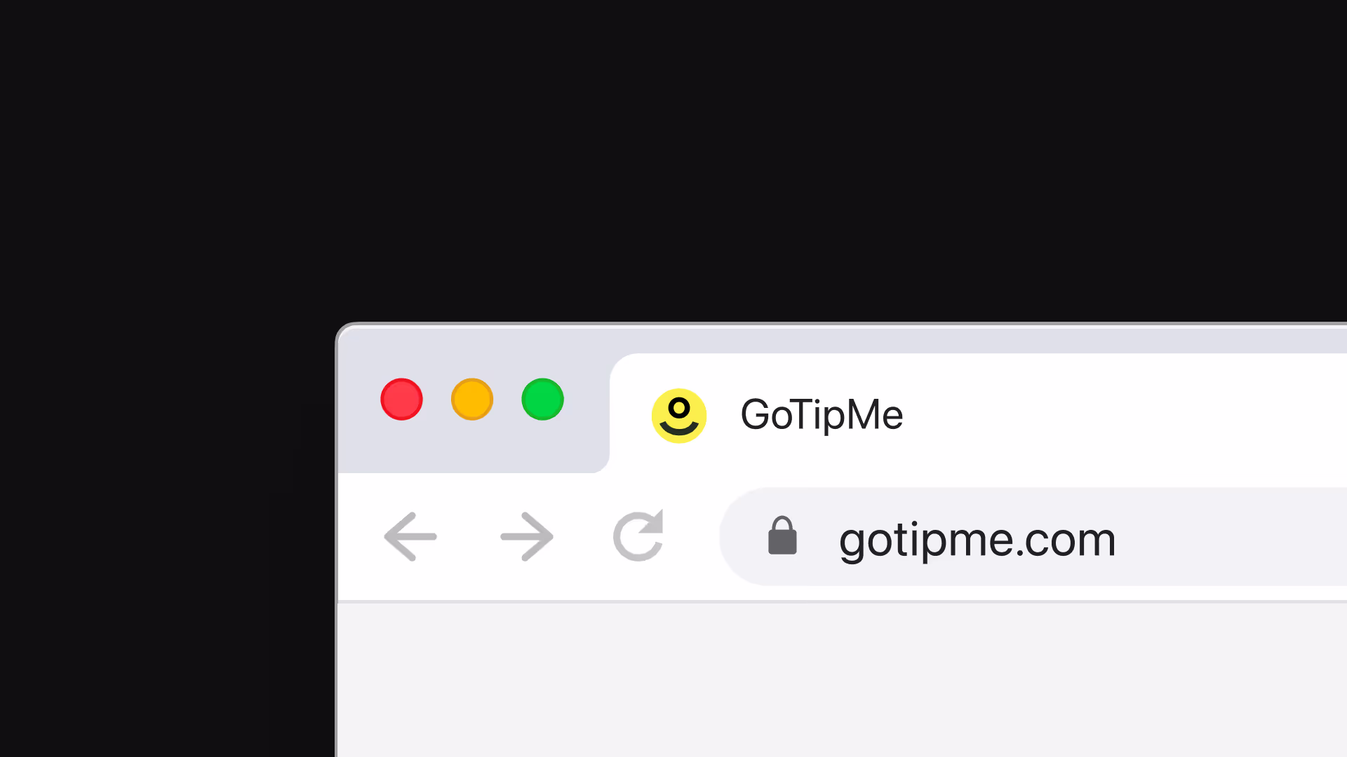
Iconmark
The iconmark will be used whenever the full wordmark does not fit or work in context. The same colour rules apply as when using the wordmark.
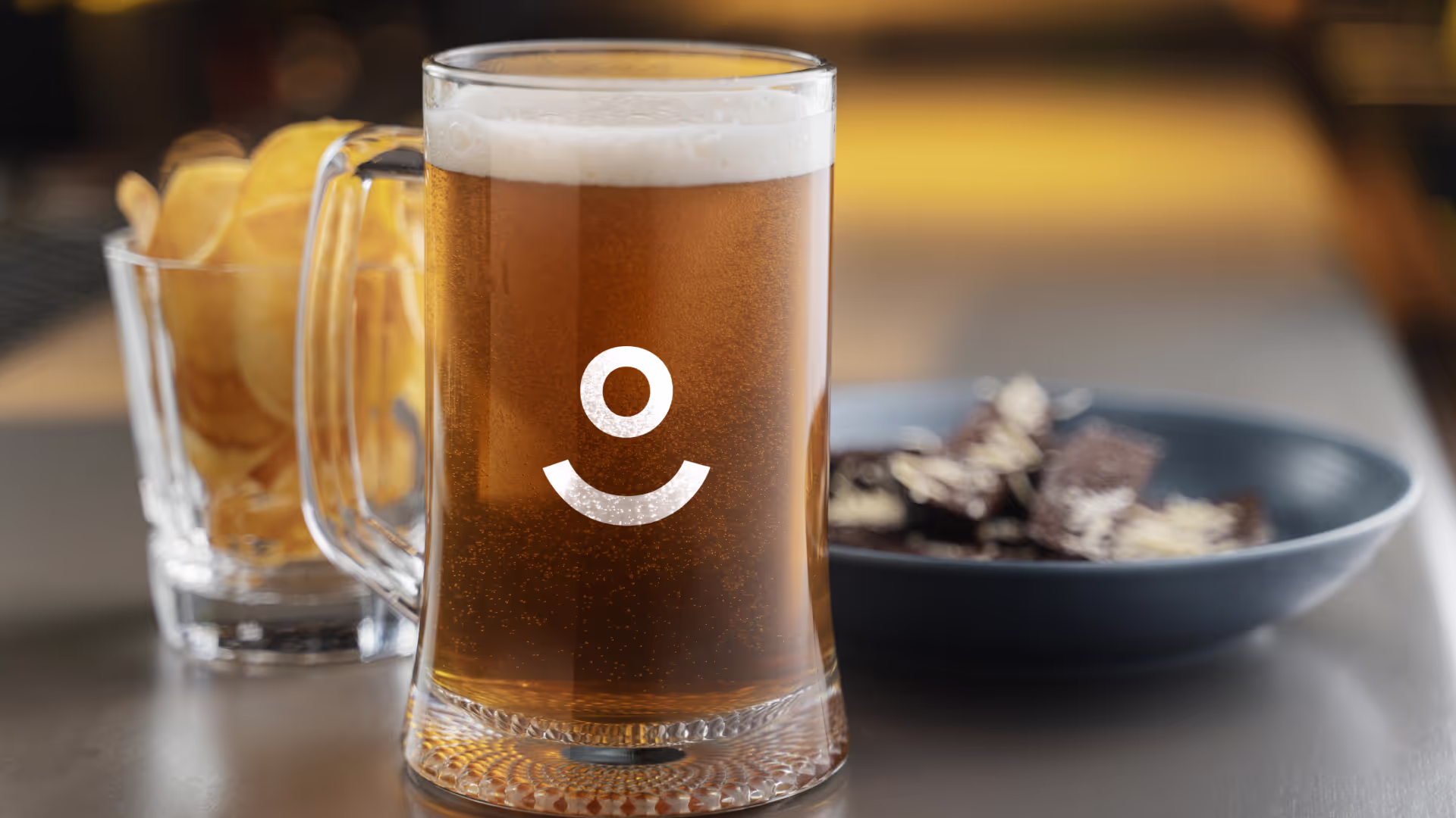
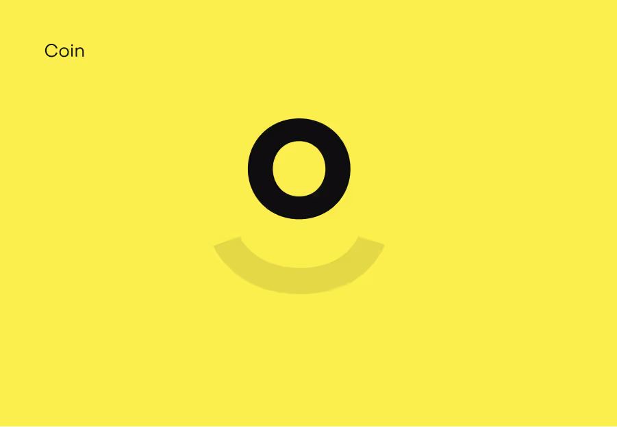
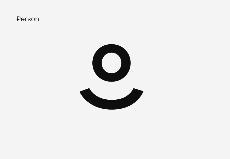
Concept
The icon mark aims to reflect the primary purpose of the brand - Building a relationship between bartenders and pubgoers. The platform promotes and supports relationship building while rewarding great hospitality by encouraging pubgoers to tip.
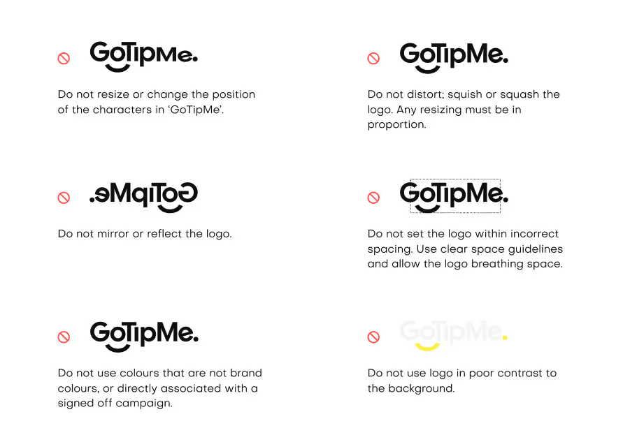
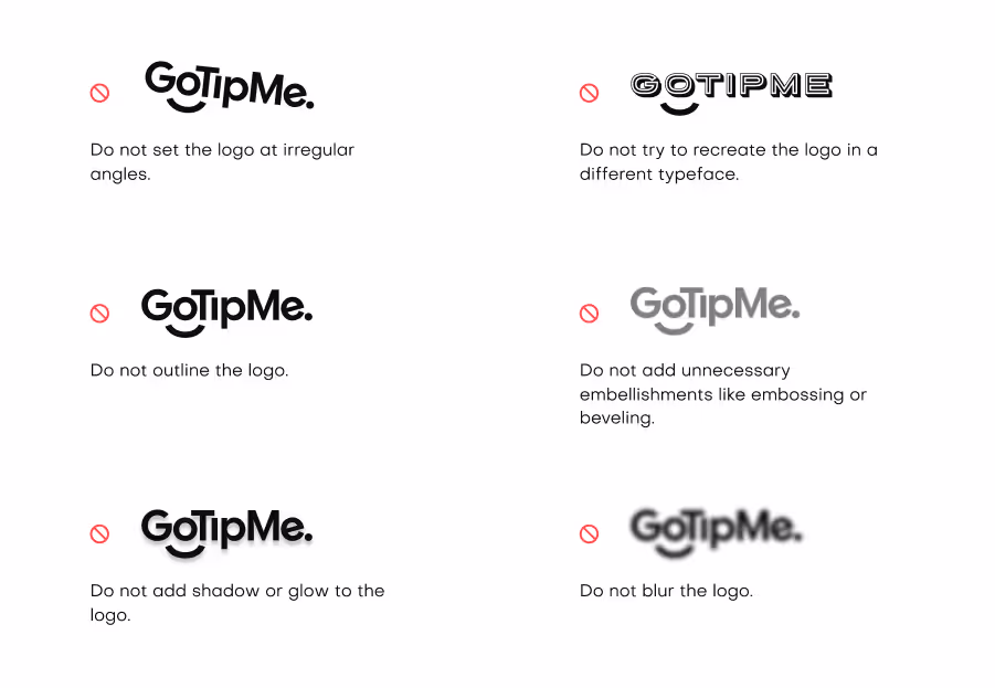
Correct Uses
Incorrectly using our logo can have a very negative impact on the GoTipMe brand. Please ensure none of these applications is ever used.
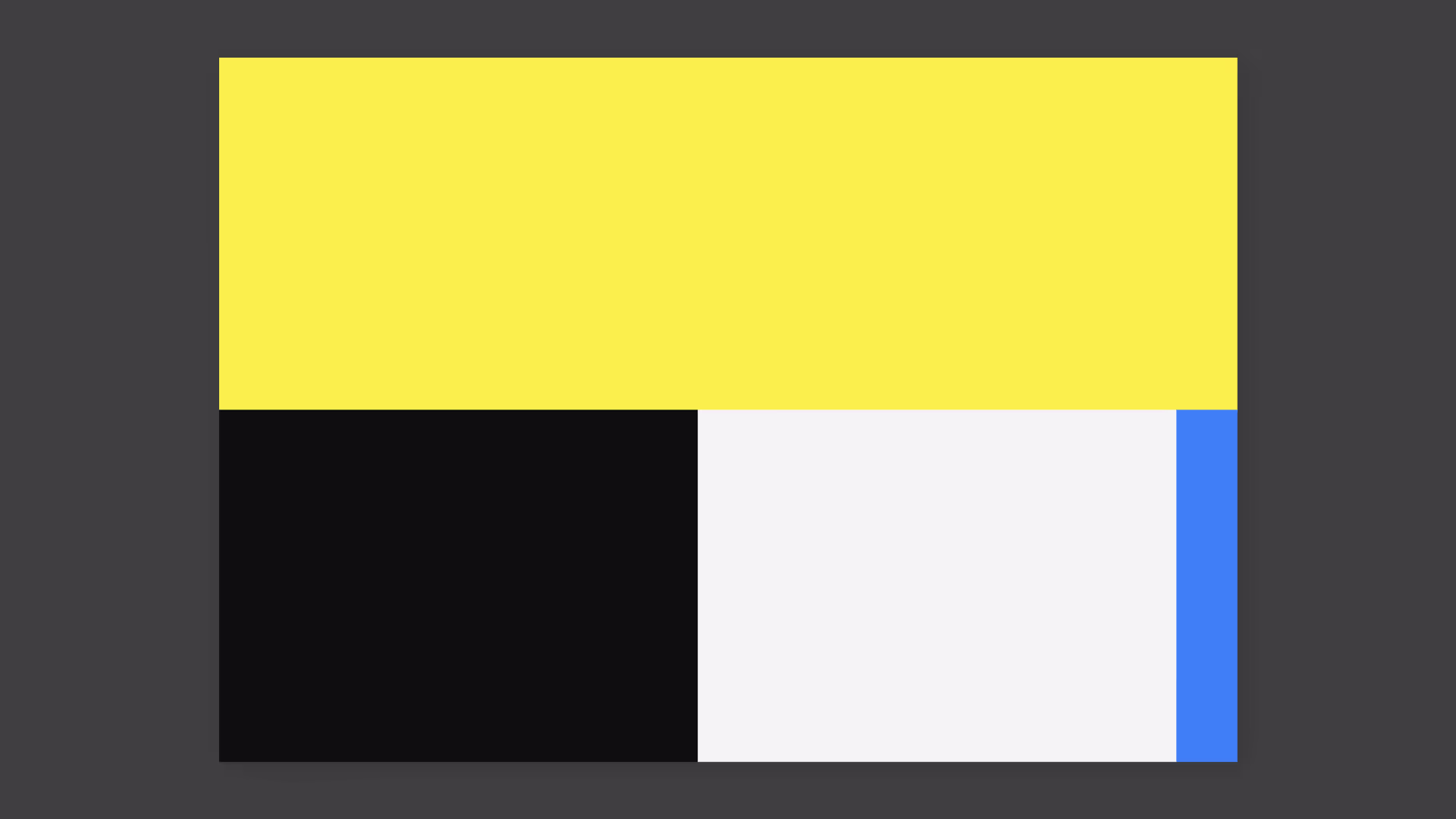
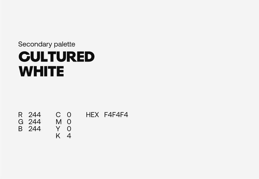
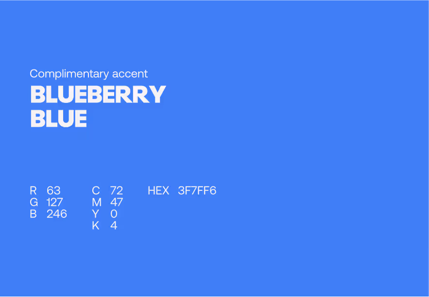
Colour Usages
The more significant the portion of the block, the more we use the colour. Yellow is to be used most, supported by White and Black. Blue is to be used as an accent colour sparingly. For example, to use as an accent when on a white background, highlight a call-to-action button online or an arrow on a presentation.
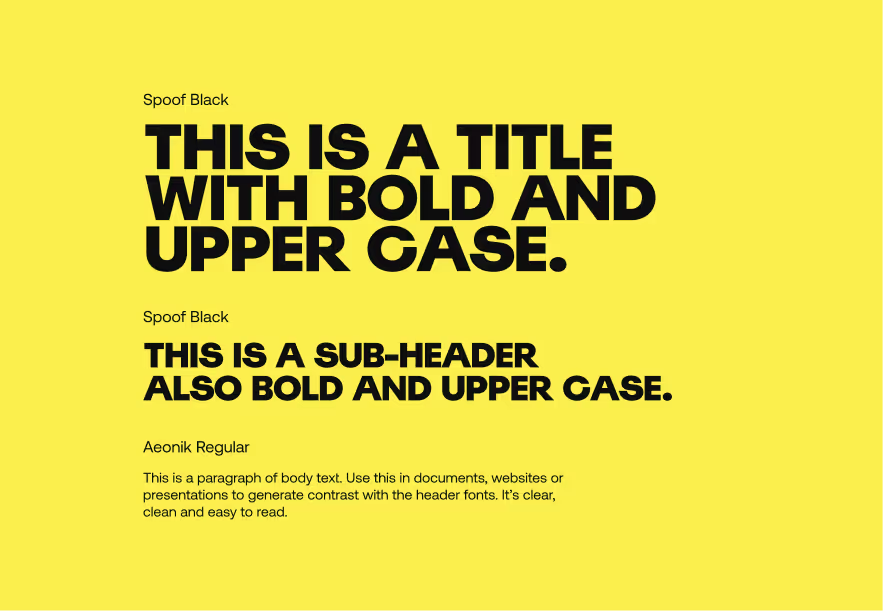
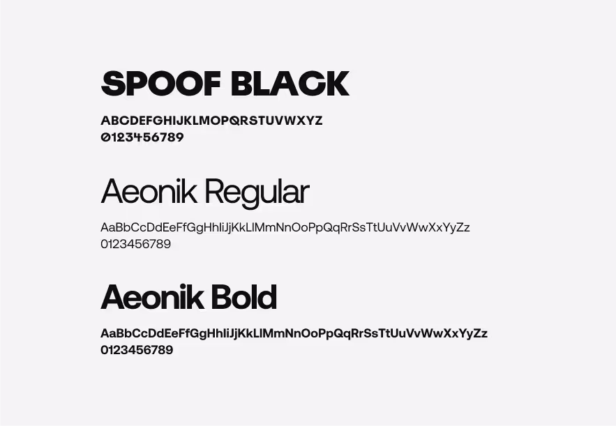
Typography
Spoof Black should be used to differentiate from the lighter body font, generating an impactful contrast between both. Aeonik Regular for body text, using size and letter case to establish a hierarchy such as body, captions, tags, etc. Aeonik Bold should be used to highlight elements in the body text, as well as the mentioned above hierarchies such as captions, tags, etc.
We can discuss, your project, our services, relevant past work, our rates, and how we can work together on call. Alternatively, you can email us at hello@shoreditchdesign.com or call us on +44 7440547661
