Mili.ai

Overview
At Mili.ai, we are revolutionising recruitment technology. Our brand's visual identity deliberately reflects our core mission: launching a magical, transformative, and innovative product. We aim to leave users in awe with Mili.ai's simplicity and efficiency—it should feel like magic in action. As custodians of the Mili.ai identity, your commitment to these guidelines ensures consistency and reflects your value in maintaining our brand's integrity.
Primary Logo
The logo is the face of Mili.ai — the primary visual expression we use to identify ourselves. It is comprised of a modern, unique slab serif font - modified with sharper angles - creating a bold, and confident first impression. The ‘i’ is a stylised wand with digital sparkles or stars, representing the blend of magic and AI technology. The Logo should only be used in the colour combinations shown in this document with a solid fill.


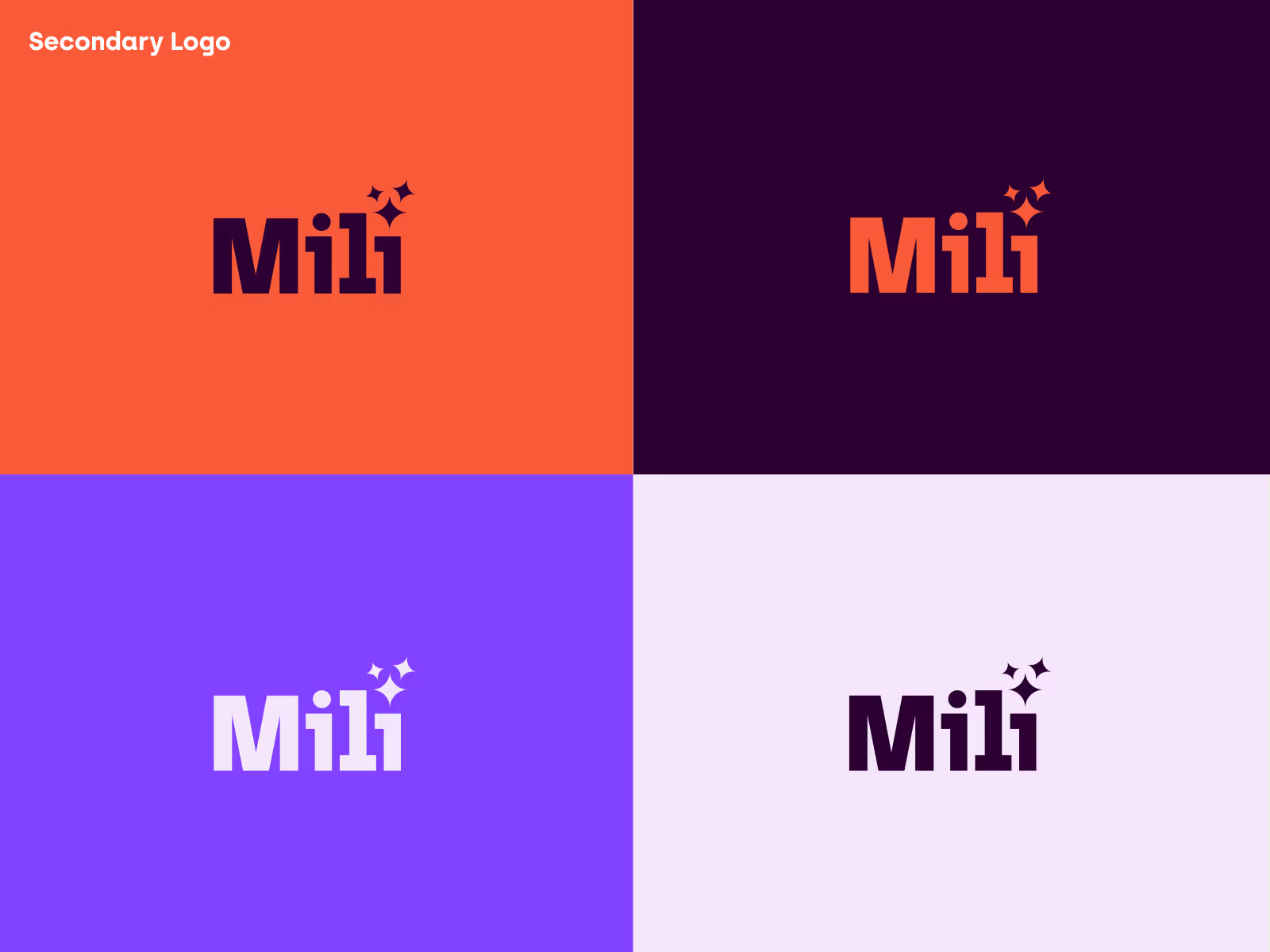
Secondary Logo & Favicon
There are some cases in which the full word mark will not fit or work in context, such as a favicon or app icon. In these cases we will use the secondary logo or the Favicon. We will only use the icon in colour combinations shown below in Plum and Tangerine or Pearl White and Blackcurrent.


Colour Palette
Colour is a crucial foundation for our brand's identity. Our palette reflects our tone of magical, bold, and future-forward. Mili.ai’s primary colour palette consists of our signature Plum, Lilac, Violet and Tangerine, complemented by Pearl White and Blackcurrant. All colours in the Primary Palette can be used as solids, with opacities, or in gradients. Use the primary gradient as a background for hero sections on the website and landing pages or marketing collateral to create a strong visual impact. The primary colour palette Tangerine (#F95A37) Lilac (#F6E6F) and Violet (#8143FF) can be used to create radial gradients on both light and dark backgrounds. Always ensure sufficient contrast between gradient backgrounds and overlaying text or elements.


Typography
The Milli.ai font family is comprised of Archia, our logo font and Objectivity. Archia, a modern slab serif is to be used for Titles and Headers. While our body font for is Objectivity, a open source geometric font family. Objectivity is objective, neutral and clean. The font family was designed to be a workhorse which makes it perfectly suitable for UI, web design, posters and marketing materials.


Iconography
Our Iconography is sourced from Streamline icons who offer a comprehensive set of free icons that will be used in our UI design system. New icons can be added as needed, but the design should follow the same outline style as the existing set, ‘Ultimate Regular’, a minimal and geometric line style. The right balance between legibility and minimalism. Appearance: Icons should have clean lines with consistent line thickness. Colour: Use the brand's primary colour scheme. Icons should primarily be Mili Blackcurrent (#0B0016) on light backgrounds and Mili Tangerine (#F95A37) on dark backgrounds. Icons should not use gradients or colour blending; stick to solid fills and outlines. Size: Icons should be designed for the following standard sizes: 16x16, 24x24, 32x32, 48x48, and 64x64 pixels. Icons must be scalable. Ensure they maintain clarity and sharpness at different sizes. Keep the aspect ratio consistent. Icons should fit within a square canvas without stretching or distortion and maintain consistent padding.


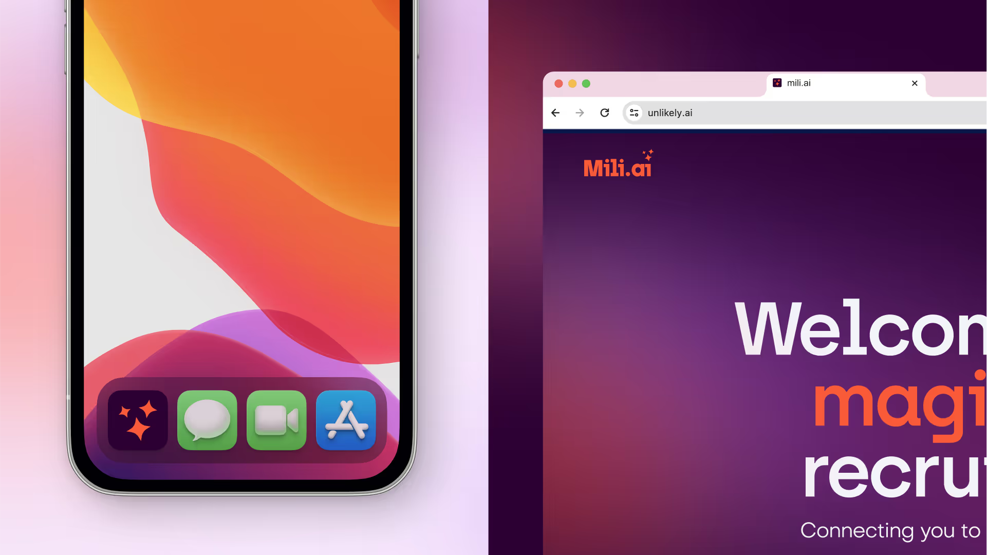
Brand in Use
These examples show correct brand use, and should be used as a reference when designing any future brand collateral.


We can discuss, your project, our services, relevant past work, our rates, and how we can work together on call. Alternatively, you can email us at hello@shoreditchdesign.com or call us on +44 7440547661
