
Brand Guidelines
Welcome to the Chairsyde AI Brand Guidelines. These guidelines are designed to help everyone working with our brand create consistent, high-quality materials that accurately reflect who we are. Our brand is more than just a logo or a tagline—it’s the story we tell, the values we embody, and the experience we create for our audience. Whether you’re designing a website, crafting social media content, or printing marketing materials, it’s crucial that every element aligns with our brand identity. This document will guide you through the core elements of our brand, including logo usage, colour palette, typography, imagery, and tone of voice. Following these guidelines ensures a cohesive look and feel across all touch points, helping to strengthen recognition and trust in Chairsyde AI.
Logo
Our logo is the visual cornerstone of our brand. Use it correctly to maintain brand integrity.
Primary Logo
The "CHAIRSYDE" logo presents a straightforward and functional design, using bold typography for clear readability. The stylized "Y", shaped like a dental chair, is a direct nod to the dental industry, reinforcing the brand’s focus. While simple, this design choice effectively communicates the platform’s purpose without unnecessary embellishments. The clean lines and structured layout keep the logo professional and easy to recognize, aligning with the platform’s role in streamlining dental workflows.


Icon Mark
The icon mark will be used whenever the full logo does not fit or work in context, such as a favicon or app icon. We will only use the icon in colour combinations shown in this document.


Colour
Colour is a fundamental pillar of our brand identity. Our palette captures the bold energy that defines us as an organisation while balancing it with a calming presence to inspire trust and confidence in our audiences.


Extended Palette
For use in UI elements, these shades are taken from the primary palette.

Typography
Brand Font Pairing
The brand typeface is Manrope, to be used both for key brand communications, such as headlines, and also in longer-form content or smaller applications like UI dashboards.
This font is licensed under the Open Font License and can be used in print and digital at the time of writing.

System Font Pairing
The brand font is available in the Google Suite therefore should be used in most purposes. Where it may not be available, such as in collaborative Microsoft Office documents where the document needs to remain editable by those who may not have access to the brand fonts then please use the system font pairing. Manrope can be used in this circumstance as well.

Accessibility
All typography colour usage should pass AAA accessibility to be inclusive.


Icons
Our Iconography is sourced from Streamline icons who offer a comprehensive set of icons that will be used in our UI design system.
Outline
New icons can be added as needed, but the design should follow the same outline style as the existing set, 1.5px stroke weight, 24x24 bounding box for primary navigation and marketing sections.

Icon Rules


Application
This section shows how we’ve applied the brand guidelines to the website and marketing materials. From typography and colour palettes to imagery and tone of voice, every element was carefully aligned with the brand’s identity to ensure consistency. These examples highlight how the guidelines have been brought to life across digital and print, creating a cohesive and recognisable brand experience.


Integrated Products
When integrated with other products, it's important to highlight the Chairsyde product and brand to maintain focus and visibility.
Integrated Products
When integrated with other products, it's important to highlight the Chairsyde product and brand to maintain focus and visibility.


Art Direction
Images
Imagery should emphasize the product’s key features, providing a clear representation of its capabilities. Photos should showcase real-life interactions with the product, highlighting its human impact.
Use muted tones to complement Chairsyde’s Mint and Deep teal, creating visual harmony. The overall composition should remain minimal, with ample space to convey clarity and simplicity, mirroring the straightforward nature of the product itself.


Textures & Shadows
Flowing textures convey a sense of efficiency and simplicity, and this should be consistent across all touchpoints to maintain a strong brand identity. These textures should mainly serve as backgrounds when paired with minimal, simplistic foreground elements.


Product images/videos
Product elements can be highlighted to showcase the range of features and draw attention to key aspects of Chairsyde. Displaying elements individually ensures the feature becomes the main focus, allowing it to stand out more effectively.


Application
Pitchdecks
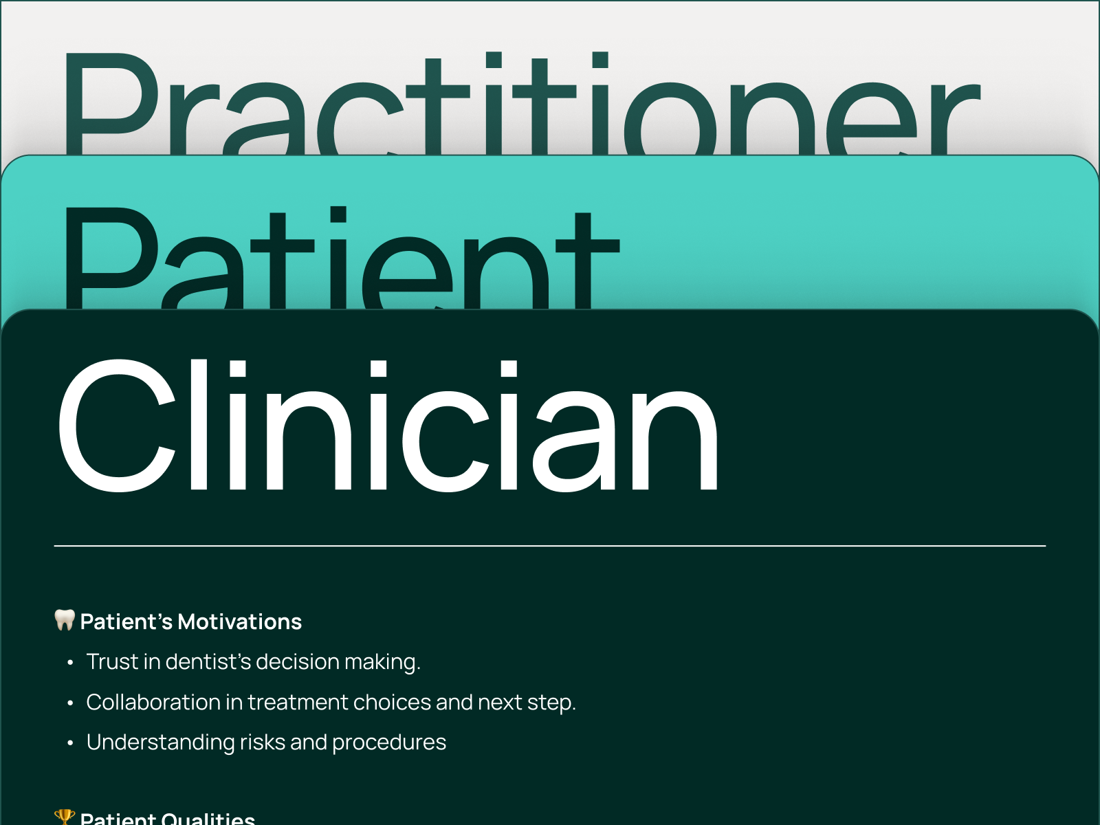
Chairsyde AI pitch decks should be clear, professional, and engaging. Deep Teal works best for covers and section dividers with minimal text, while White and Mint keep content-heavy slides easy to read. Manrope should be used throughout for consistency and accessibility. Slides should be concise, with a balance of text and visuals. Use brand imagery and iconography sparingly to highlight key messages without adding clutter.


Social Media
Our social media should be clear, engaging, and visually consistent. Use the brand colour palette, Manrope typography, and minimal graphics to keep posts clean and professional. The flowing texture can be used subtly in backgrounds to reinforce the brand. Keep messaging concise, balancing product insights, industry trends, and customer stories while maintaining an approachable tone.


Partnerships
Chairsyde AI’s brand should be presented clearly and professionally in all partnership materials. When using “Powered by Chairsyde AI,” the logo can sit either below or to the right of the text, with enough space to ensure readability. Co-branded materials should balance both identities while maintaining Chairsyde AI’s visual consistency in colour, typography, and layout. Messaging should highlight shared values and the benefits of collaboration.

