Brand guidelines
Welcome to the Saya Brand Guidelines. This document is here to help you bring Saya to life with clarity and consistency. Our brand isn’t just how we look; it’s how we think, speak, and connect with people. Every word, color, and interaction shapes how others experience us.
These guidelines will help you create work that feels unmistakably Saya: modern, confident, and built on genuine human understanding. Whether you’re designing digital experiences, social content, or print materials, follow these principles to keep our identity strong, cohesive, and instantly recognizable.
Saya logo
Our logo represents who we are, a confident mark of clarity and intention. It reflects Saya’s balance of innovation and warmth: bold enough to stand out, refined enough to earn trust.
Use the logo correctly and consistently to preserve our integrity and recognizability.
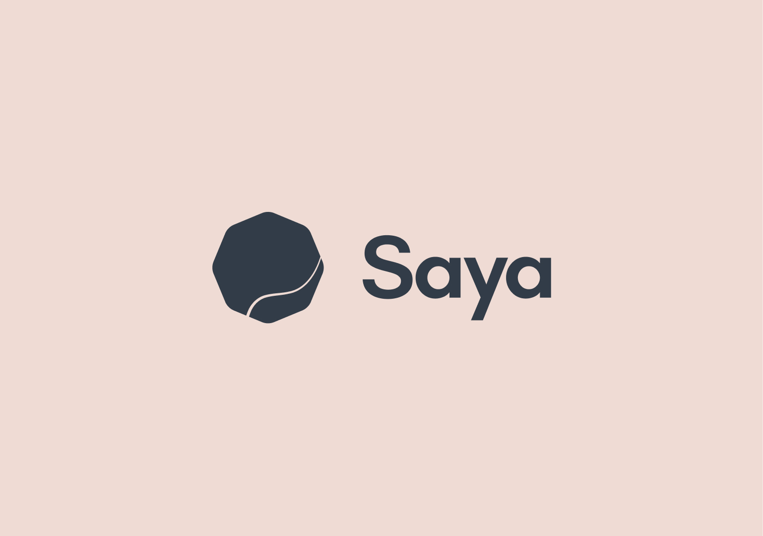
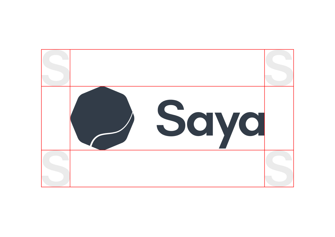
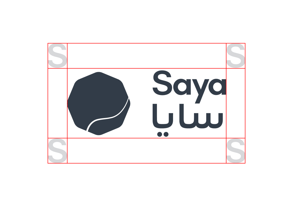
Primary logo english
The Saya logo embodies calm confidence. The wordmark has been carefully crafted to feel both accessible and empowering, reflecting our brand’s grounded trustworthiness.
Pair it with plenty of breathing space and use it with intention. Every application of the logo should reinforce the sense of balance and transparency that defines Saya.
Use cases:
Use the English logo for global and default platforms, including the main website, international social media, official global presentations, and all materials where English is the required primary language. This format can also be used for square or centered layouts, such as social media posts, centered packaging labels, or video thumbnails.
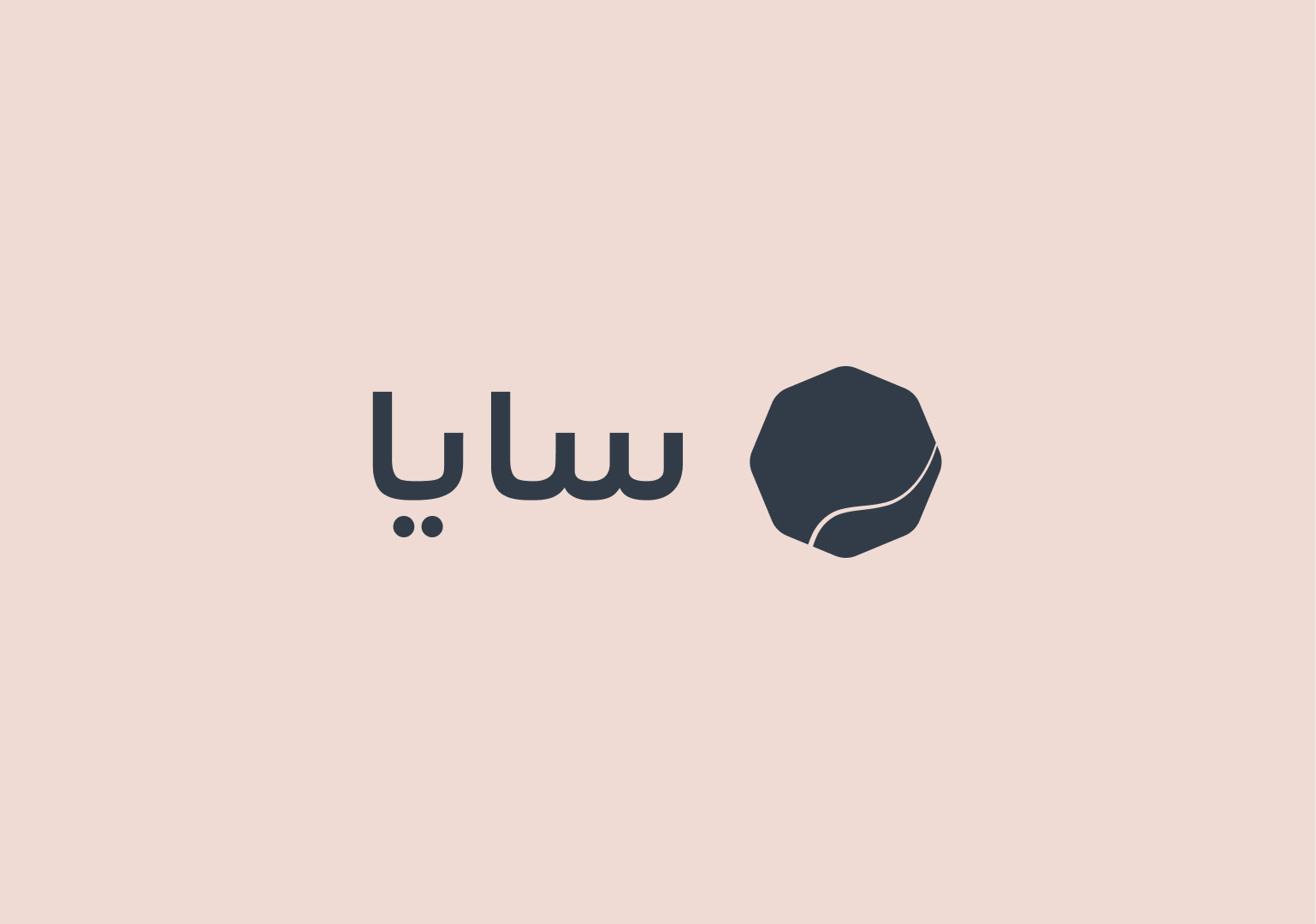
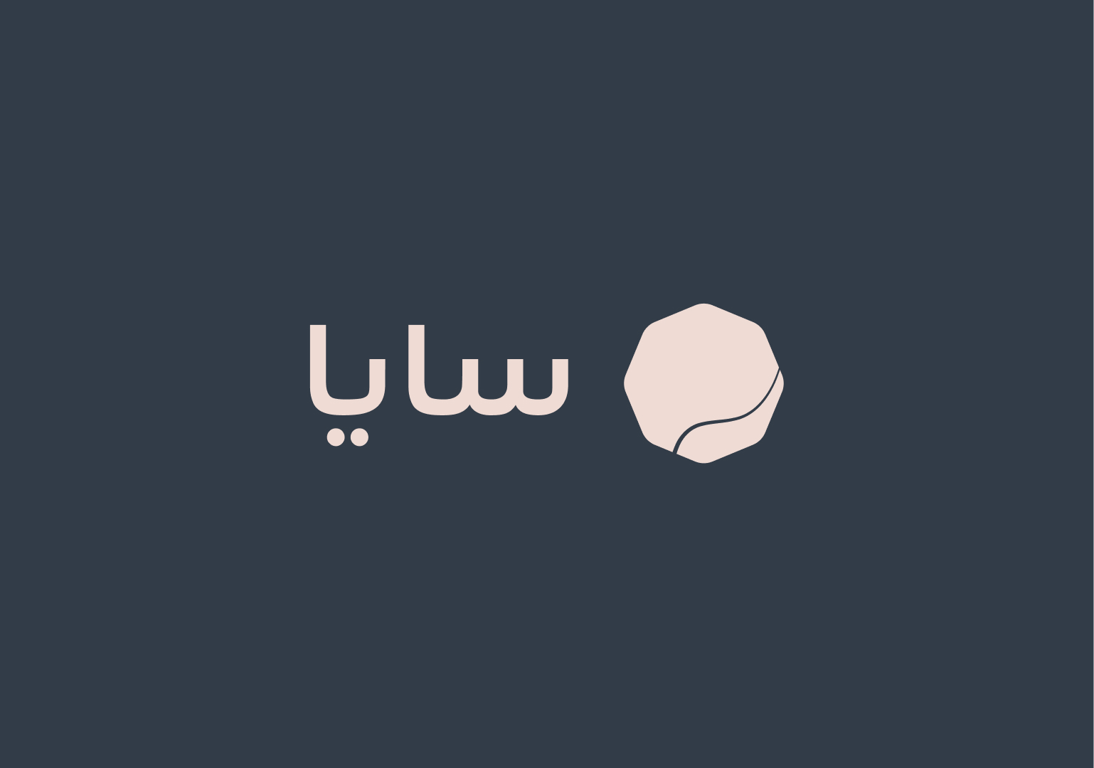
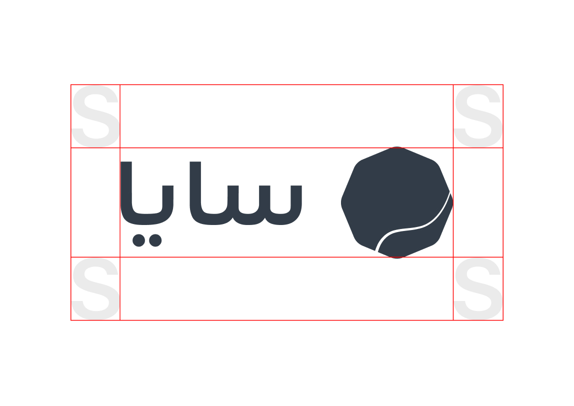
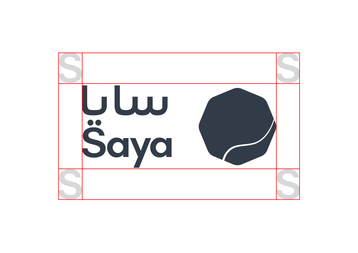
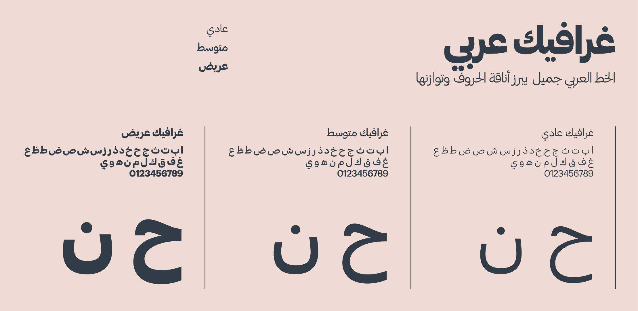
Primary logo arabic
The Arabic logo embodies Saya’s identity through a design that feels both timeless and contemporary. It represents our connection to Arabic-speaking audiences while maintaining the same strength, confidence, and balance as the English wordmark.
This version should be used when communicating exclusively in Arabic or in contexts where Arabic is the primary language. It reinforces our respect for cultural authenticity and ensures Saya always feels local, relevant, and approachable.
Use cases:
Use this version for dedicated Arabic platforms, including the localized version of the website, the mobile app when set to Arabic, and all communication exclusively targeting Arabic-speaking audiences, ensuring brand familiarity and cultural relevance.
Dual language logo
Our dual-language logo brings together both the English and Arabic wordmarks to create a single, unified brand expression. It represents Saya’s commitment to accessibility and cultural connection, ensuring our identity feels authentic and inclusive across every audience.
Both languages should feel equal in presence, with balanced spacing and proportion that maintain harmony and legibility. The design reflects our belief that communication is strongest when it’s clear and inclusive.
Dual horizontal
The "text on opposite sides" logo style is best defined as accessible and trustworthy. It is accessible because it presents the name in both scripts (Arabic and Latin), removing language barriers for a bilingual audience. It is trustworthy because it shows respect and commitment to local markets by communicating clearly in the native script.
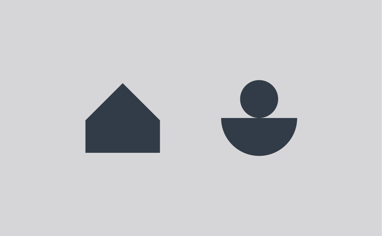
Icon mark
Reserve the standalone mark for the smallest spaces like website favicons and app icons, or as a subtle watermark. The icon is a shorthand for Saya's confidence and clarity; therefore, treat it with care and only use the approved color combinations shown in this guide. Use it when text visibility is impossible or when its simple shape needs to serve as an instant, recognizable visual reference.
Clear space
Allow space around the logo equal to the height of the letter “S” in Saya. This ensures the mark has room to breathe and maintains its impact.
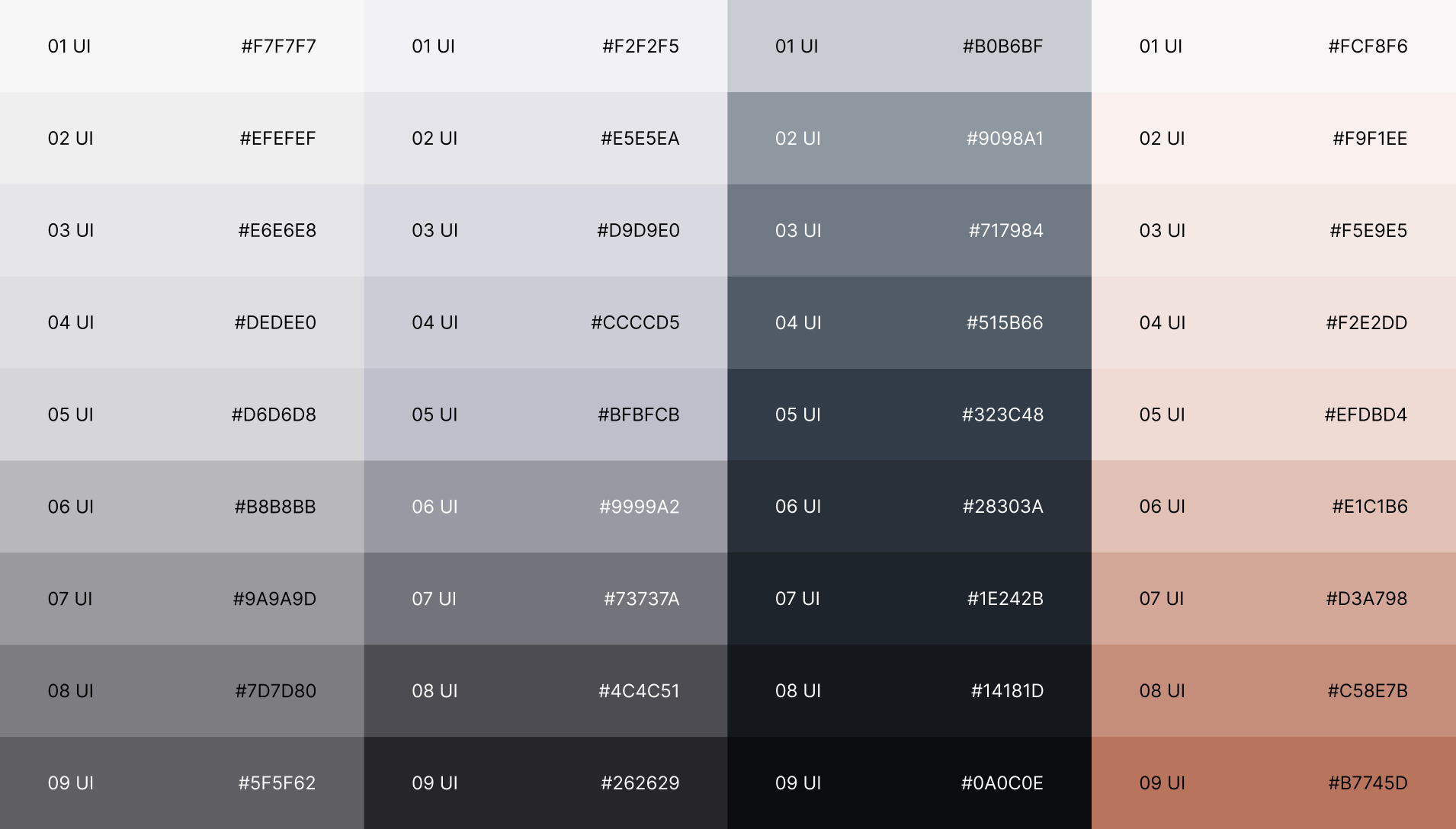
Color
Color is one of our most powerful brand tools. It helps us express emotion, energy, and personality before a single word is read.
Our palette is designed to balance vibrancy with sophistication, combining confidence and warmth to reflect the energy behind Saya. Use colour intentionally. Lead with Saya soft asset pink for key accents or backgrounds, supported by charcoal for contrast and off white for balance.
Primary brand colors
Our primary colors represent the essence of Saya: clarity, energy, and modern optimism.
- Dark mode standard (High contrast, core readability): Midnight (BG) with Soft Assets (Text).
- Light mode standard (Neutral background): Soft Assets (BG) with Midnight (Text).
- Graphical elements/Buttons: Midnight (for primary button BG) with Soft Assets (Text), and Soft Assets (for secondary button BG) with Midnight or Stone (Text).
General rule for graphic colors
Default graphic/Icon color:
The primary color for all graphs and icons should be Midnight. This dark shade provides excellent contrast on the three lighter backgrounds (Soft Assets, Stone, and Foundation Mist).
- Inverse graph/Icon color:
- When the background is Midnight, the graph or icon must be Soft Assets to provide the necessary visual pop and clarity.
-
- Never pair:
- Avoid pairing light colors (Soft Assets, Stone, Foundation Mist) on light backgrounds (Soft Assets, Stone, Foundation Mist), and avoid pairing Midnight on a Midnight background, as these violate contrast and readability guidelines.


Extended palette
For use in backgrounds and UI, these shades are taken from the primary palette.
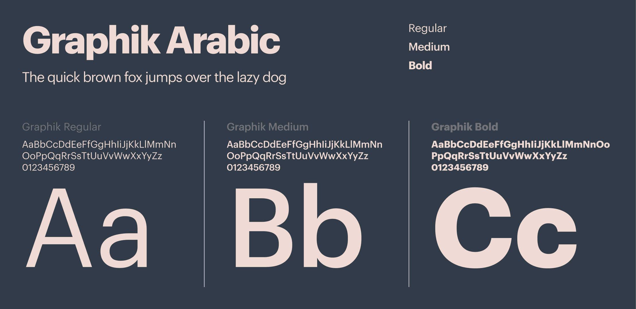
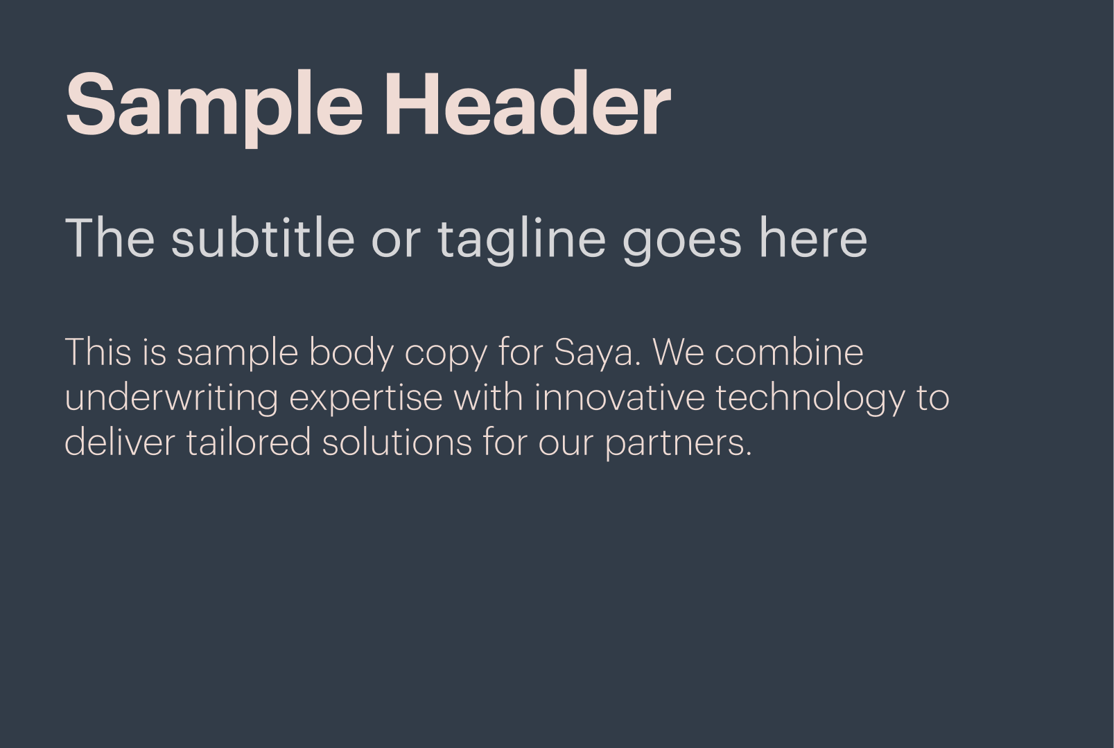
Typography
Brand font
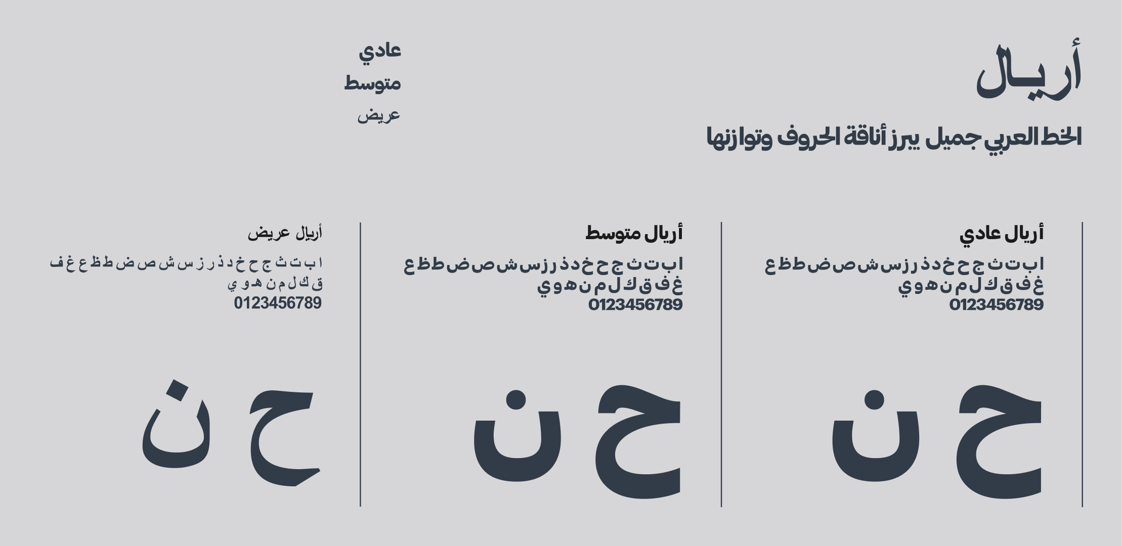
Graphik Arabic is our core brand typeface, curated by Commercial type. Modern, refined, and easy to read, it brings clarity and consistency to every piece of communication. From marketing to customer touchpoints, it ensures Saya always speaks with confidence and precision.
System font
Use in the Google Suite or Microsoft Office suite, where the document needs to remain editable by those who may not have access to the brand fonts.
For example:
- When creating content on platforms or tools that don’t support custom fonts.
- For shared collaborative documents with external partners, to ensure everyone can edit them correctly.
- In emails, where custom fonts may not display properly on all devices.
‘Arial’ is to be used in place of Graphik.

Accessibility
All typography color usage should pass AAA accessibility to be inclusive.
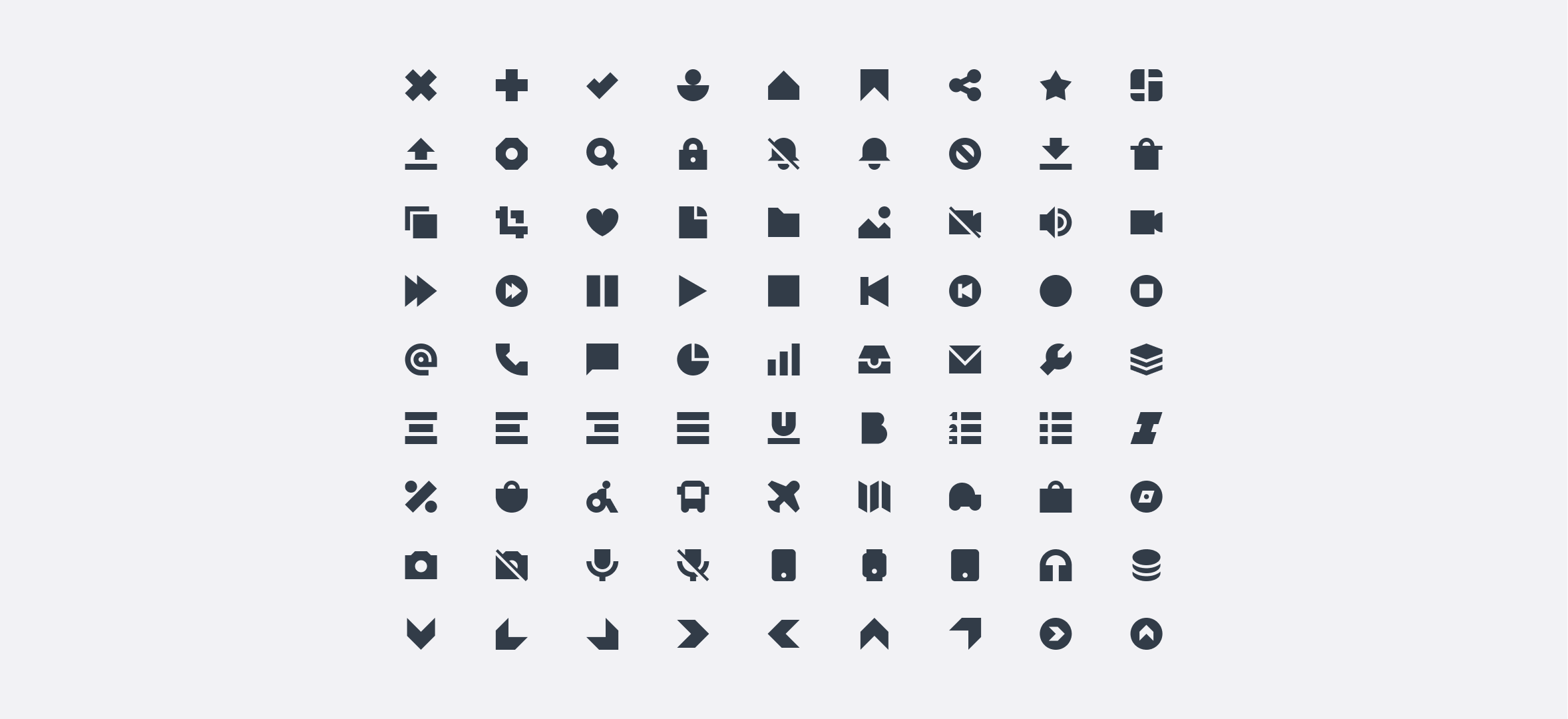
Icons
Our Iconography is sourced from Streamline They offer a comprehensive set of icons that will be used in our UI design system. The iconography matches the confident, blocky approach of the graphic elements, continuing the building-blocks metaphor. This pairs neatly with the photography style of textured, rocky landscapes.
Solid
The icons utilize a solid, filled style, presenting a uniform and monolithic appearance without any external stroke or outline. These assets are optimized to be rendered at 24x24 pixels and are primarily used for supporting text, buttons, and form elements. Any new icons added must adhere strictly to this established solid, filled style to ensure visual consistency across the 24x24 rendering size.
Icon rules
Layout
Our layouts are underpinned by an 8-column grid across all formats, bringing a sense of technical precision and allowing for a great deal of flexibility for different types of content.
Margins are sized at 64px on the width of the page, bringing a sense of scale and expanse to our layouts.
Social media assets and reports
When creating social media assets, reports, or any other digital content, ensure there is ample white space (or negative space). This empty area around text, images, and other elements is crucial for maintaining a clean design and improving content legibility. Insufficient clear space can result in a cluttered and difficult-to-follow visual experience.
Additionally, the use of grids is highly recommended. Grids aid in achieving precise alignment and spacing, ensuring that all elements are organized and balanced. A deliberate combination of white space and grids will consistently lead to more visually appealing and effective results across all your digital deliverables.
Art Direction
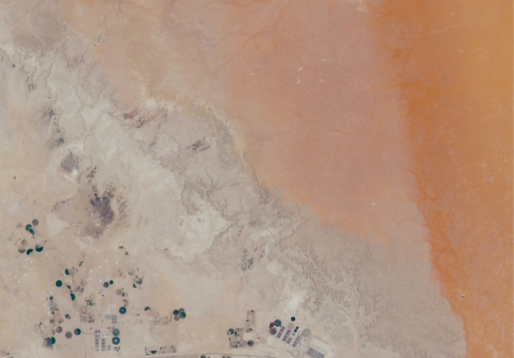
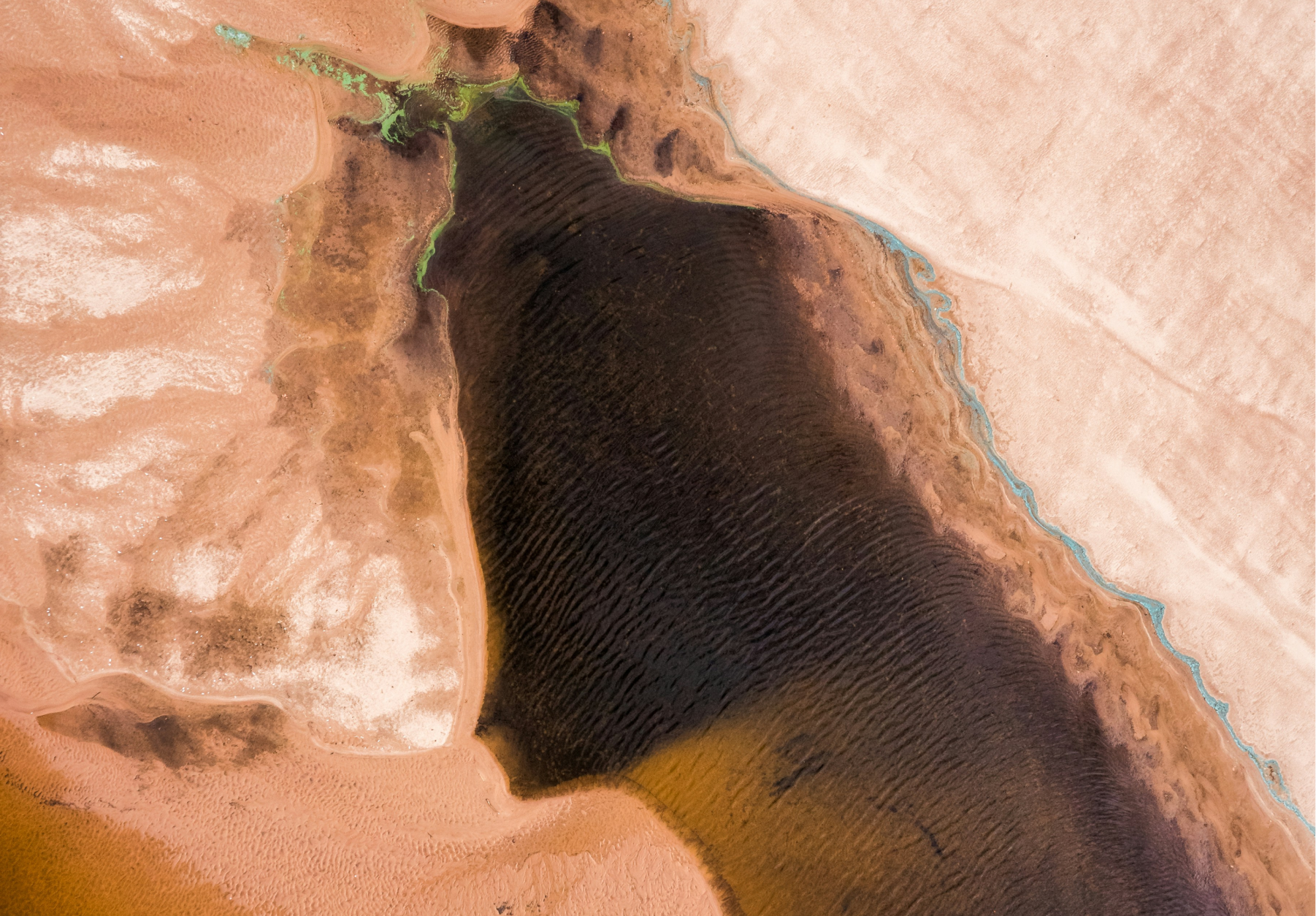
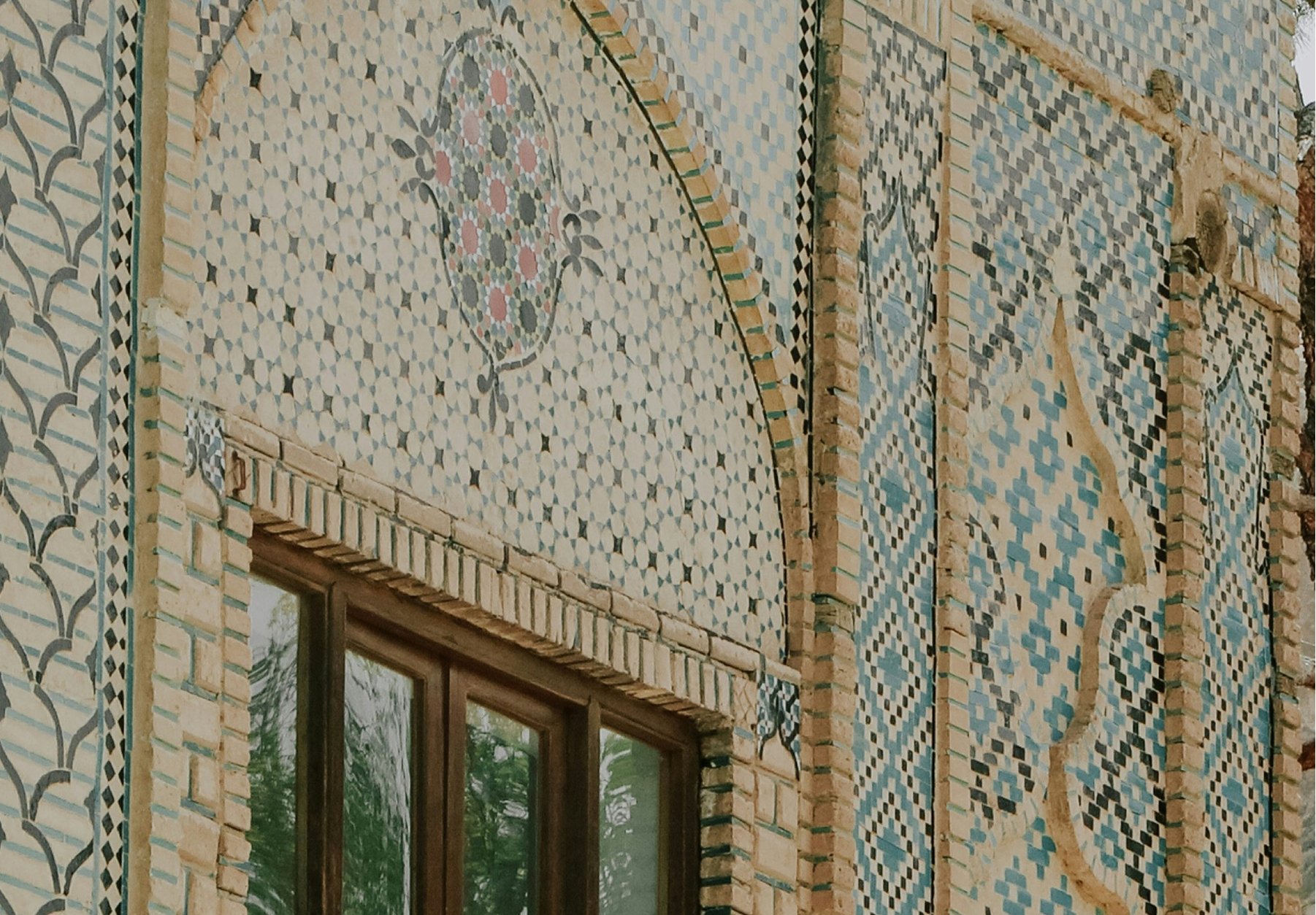
Macro
The macro represents perspective, empowerment, and scale. It reflects Saya’s role in helping people see the bigger picture of their financial journey, guiding them with clarity and confidence. The aerial and landscape imagery communicates openness, stability, and balance, echoing Saya’s calm tone and trustworthy character.

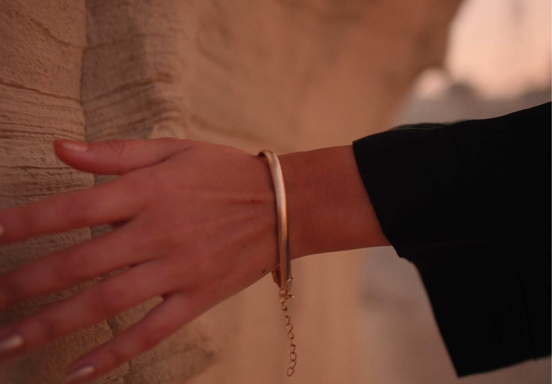
Micro
The micro is a metaphor for the clarity and human warmth in the Saya brand strategy. It focuses on the tactile and personal, hands in motion, natural textures, and moments of interaction, representing how Saya gives everyday people the confidence to borrow, save, and grow their wealth. The photography feels calm, open, and honest, reflecting the brand values “With Care” and “Open to Everyone.”


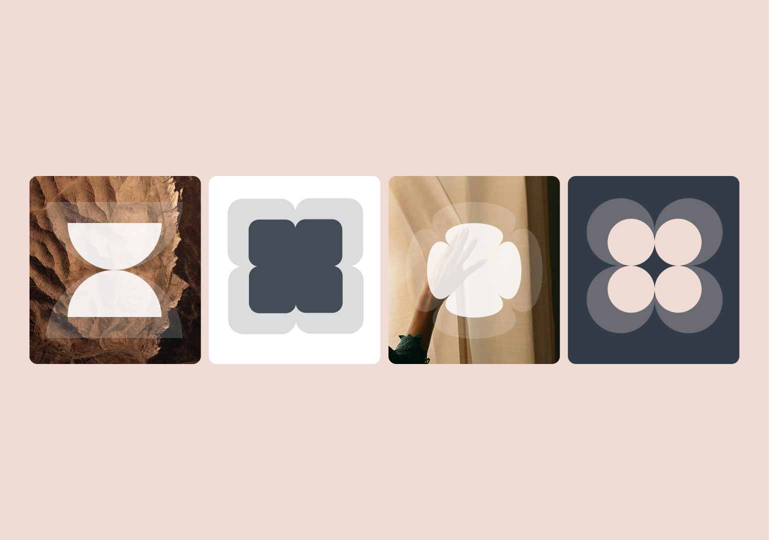
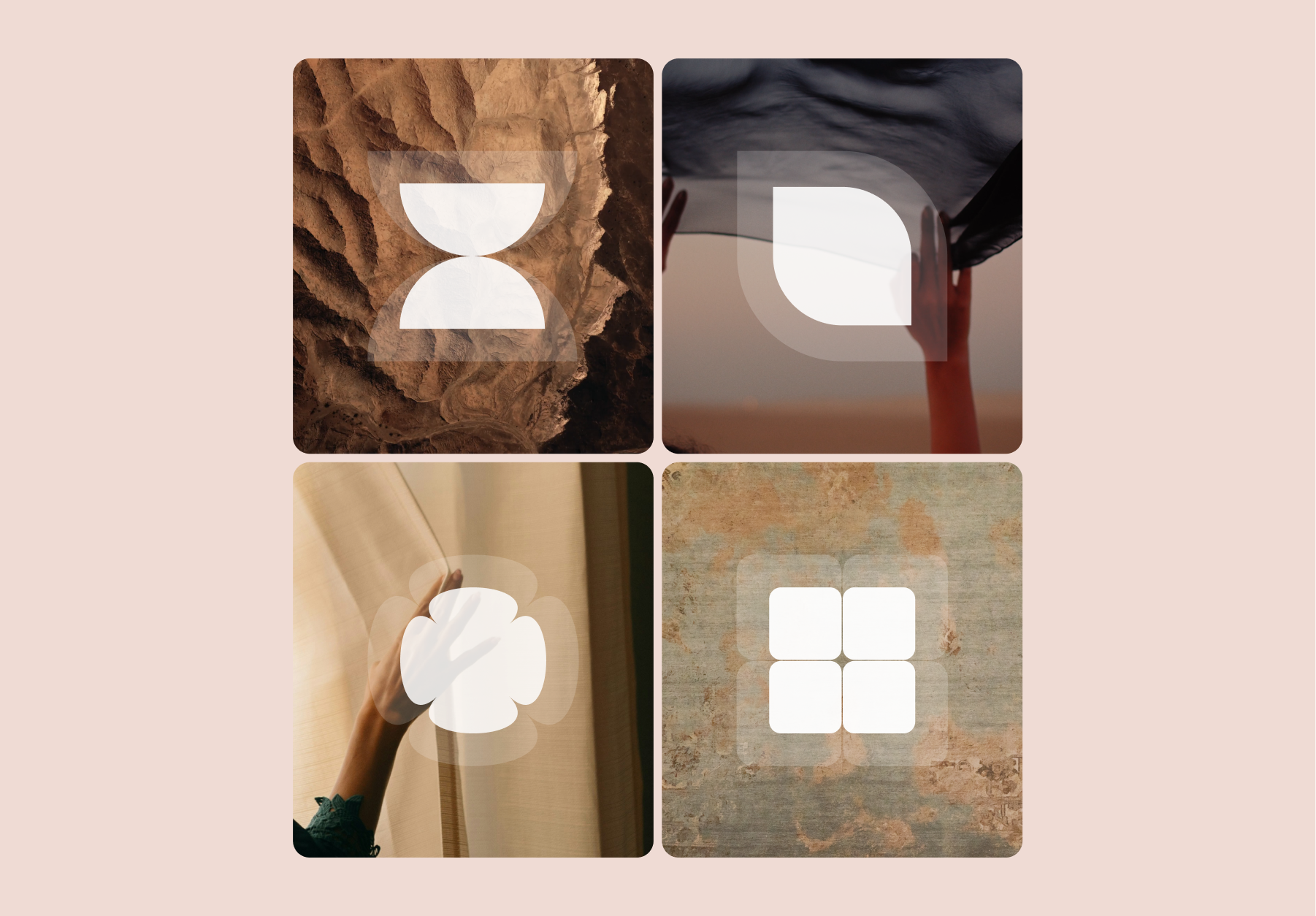
Saya graphic motif usage
The Saya graphic motif serves as a primary visual language, reinforcing the brand's commitment to clarity, structure, and accessibility. The motifs function as modular building blocks, symbolizing how individual financial actions combine to create a larger, stable financial picture.
Motif design and meaning
- Modular Building Blocks: At a macro scale, icons are enlarged to function as a metaphor for modular building blocks that add up to a larger, comprehensive picture.
- Clarity and Transparency: Motifs are rendered semi-transparent when overlaid on imagery or textures. This is a core metaphor for how Saya adds clarity to complex financial processes.
- UI Consistency: The UI iconography follows a similar rounded, blocky approach as the decorative icons, ensuring a unified and practical user experience across all touchpoints.
- Contextual Depth: Graphic icons are layered onto relevant textures or background imagery to represent specific products, ideas, or audiences (e.g., using a textured background for a Community Saver product).
Saya graphic motif usage
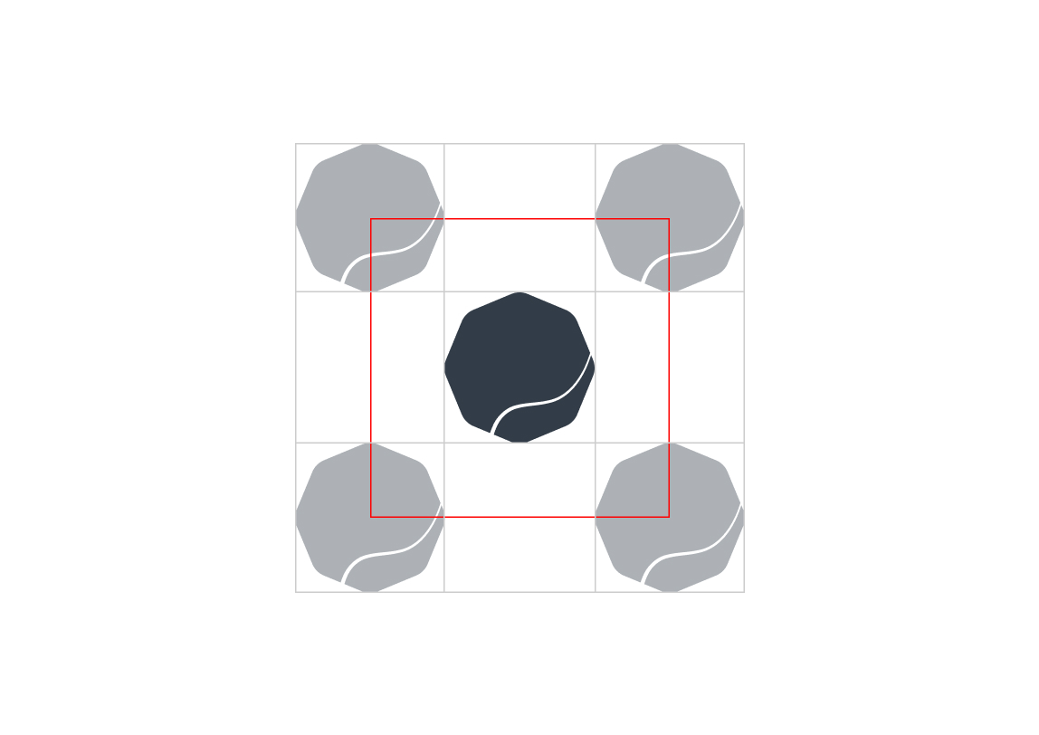
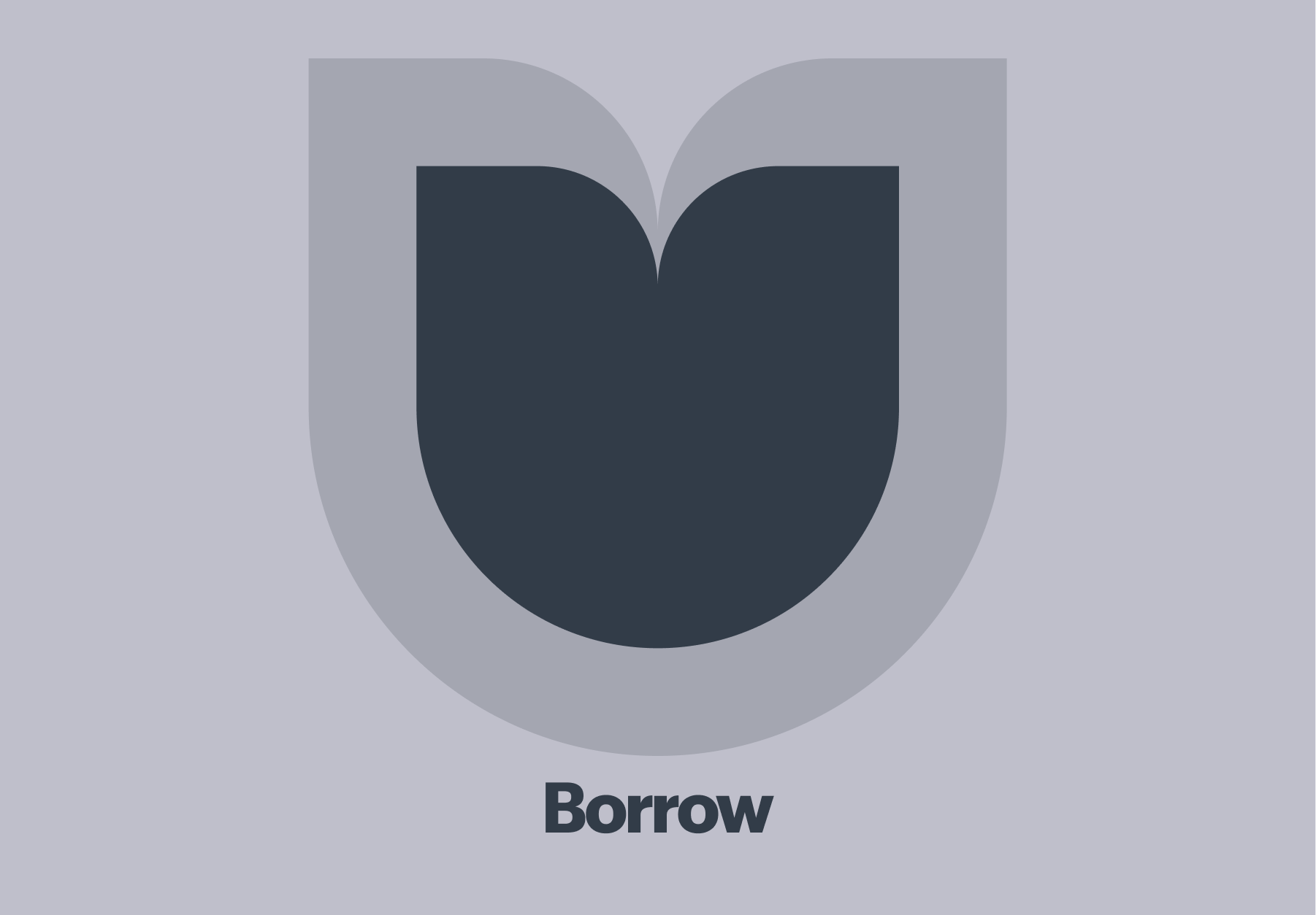
Layering
The icon in front is the same shape as the icon behind.
Foreground Opacity
The icon in front has 100% opacity.
Background Opacity
The icon at the back has 20% opacity.
Sizing
The icon in front is 75% of the size of the icon behind.
Consistency (Shape)
Keeping a thicker, blocky shape helps with visual consistency with the other brand motifs and UI icons.
Consistency (Size)
All icons in front start at the same size as other foreground icons. Similarly, all icons in the back start at the same size as other background icons.
Color Palette
All icons are made of one base color so they can work on any background with the switching of just one color.
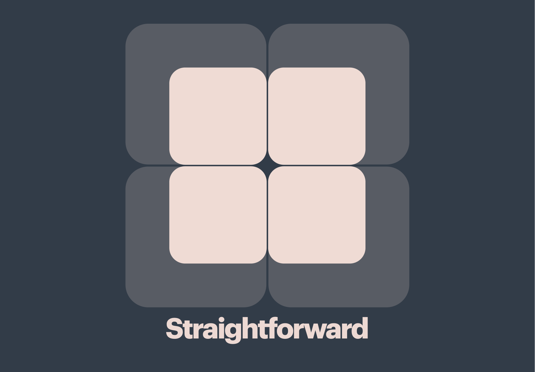
Product motif
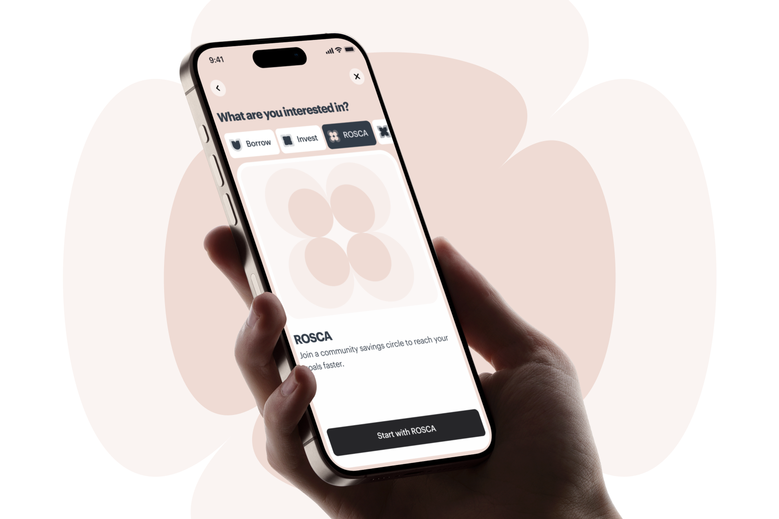
Use these graphic motifs when communicating about Saya’s products.

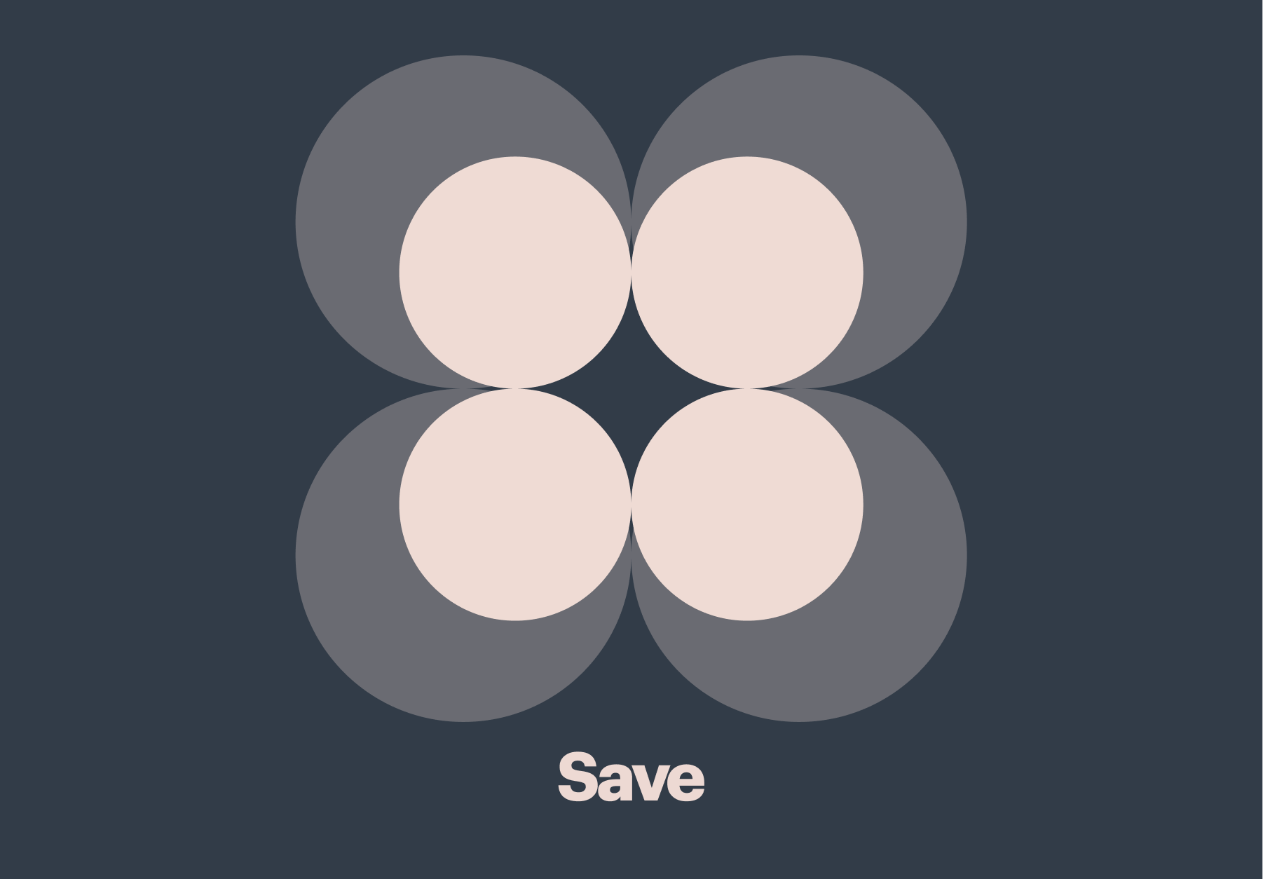

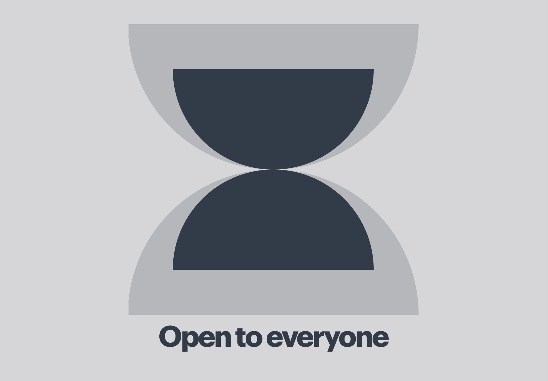
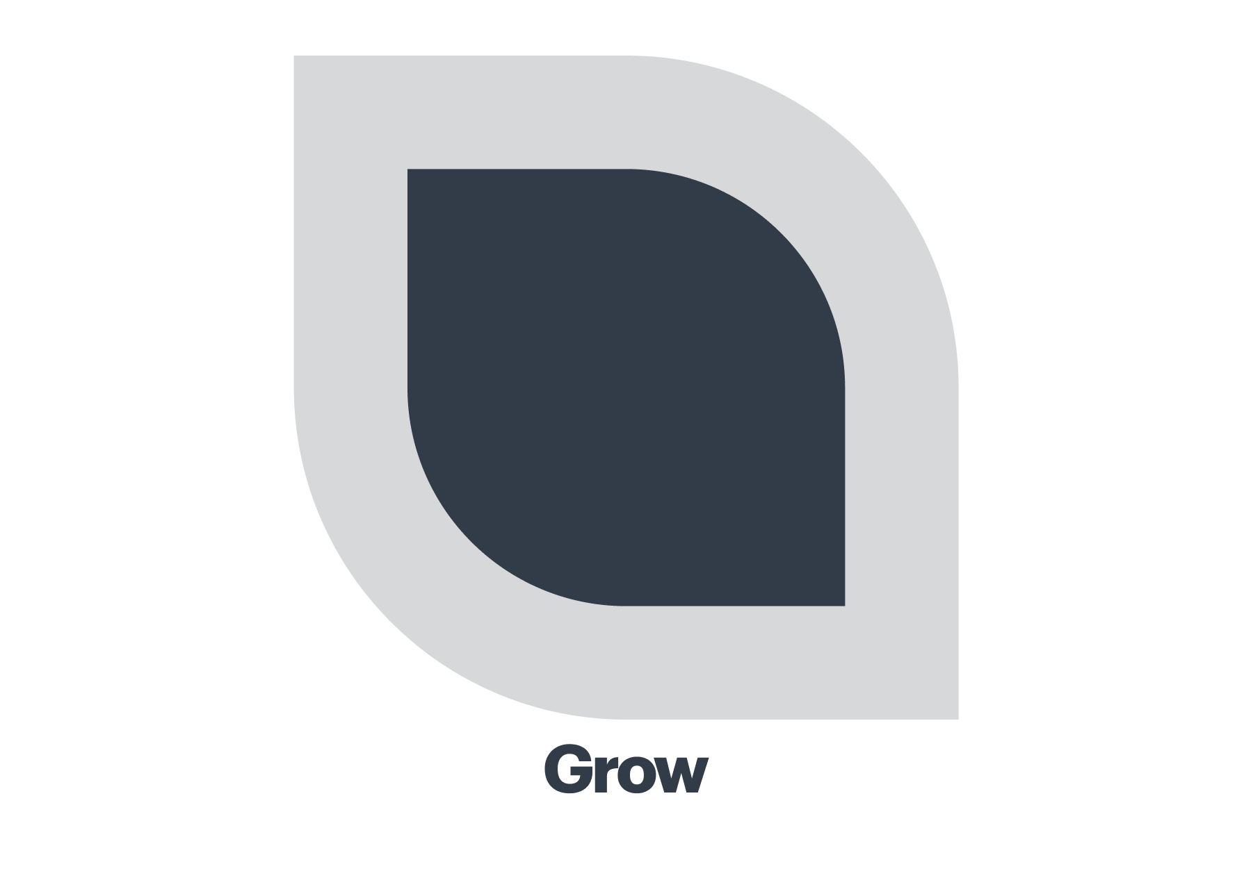
Values motif
These graphic motifs are used when expressing the values that Saya brings to the world.

Imagery and motif style
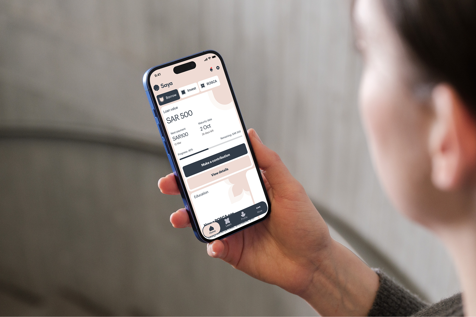
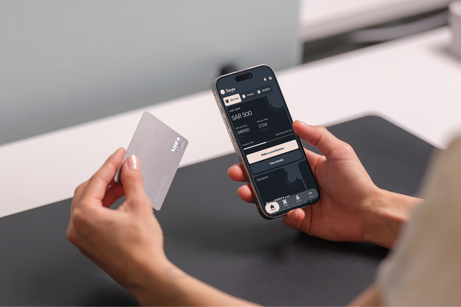
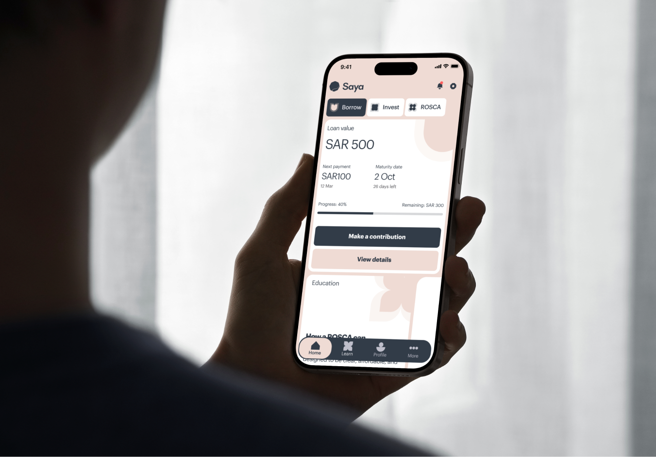
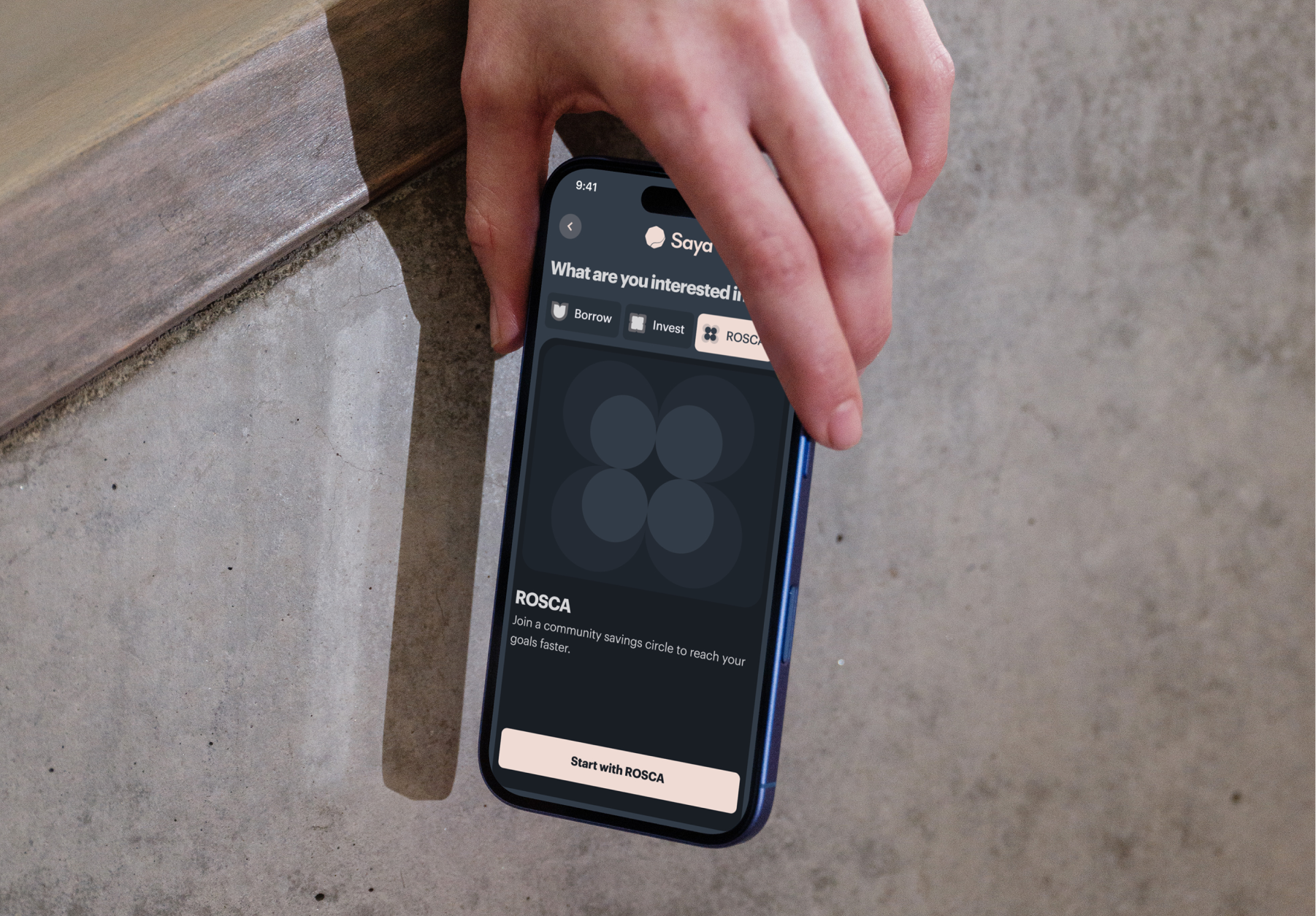
- When showcasing the Saya app on devices, use studio-lit photography that pairs the device clearly with our graphic motifs as a structural, semi-transparent background element.
-
- Photography and videography are used sparingly (25% of total usage) to add emotional depth and connection.
-
- Micro Focus: Use close-ups of hands in action (e.g., using the app, holding money) to emphasize the personal, human journey.
- Macro Focus: Use shots of nature or zoomed-out landscapes to convey stability and a sense of calm reliability.

Tone of voice
Our tone makes finance feel clear, fair, and human. It builds trust through simplicity and reassurance, while creating a sense of partnership and guidance.
Writing techniques
01. Use an active voice
We write in an active voice so our words feel direct, human and confident. Helping people connect with Saya.
Do: We make borrowing simple and transparent.
Don’t: Borrowing is made simple and transparent.
Tips: Avoid “to be” verbs like is, are, was, and were paired with past-tense verbs.
02. Write positively
Positivity makes our message supportive and forward-looking. It helps people feel confident about their choices.
Do: Once you’ve completed the steps, you’re ready to apply.
Don’t: You can’t apply without completing all the steps.
Tips: Avoid “to be” verbs like is, are, was, and were paired with past-tense verbs.
Focus on what people can do, not what they can’t. Always frame challenges as opportunities to help.
03. Keep It concise
Clear writing builds trust. We use short, simple sentences that get to the point without losing warmth.
Do: We help people build stronger financial futures.
Don’t: We will provide guidance across each stage of the process in order to ensure clarity.
Tips:
- Replace long phrases with shorter ones (e.g., “in order to” → “to”).
- Cut filler words like very, really, or actually.
- Use plain words people naturally say.
04. Grammar & style
- Use sentence case for headings (Your account details).
- Use Day, Month Year for dates (e.g., 9 December 2025).
- Use US English spelling unless localization requires otherwise.
- Use figures for numbers 10 and above and words for numbers below 10.
- Use single quotation marks (‘ ’) inside double quotes (“ ”).
- Use ‘and’ in sentences, but ampersands (&) in short headings if it improves flow.
05. Punctuation & formatting
- Always end sentences with a full stop, even in bullet points.
- Exclamation points should be rare and genuine. One is enough.
- Avoid spelling out full URLs; use hyperlinks when possible.
- Use emojis only on social media, and sparingly.
Get the full tone of voice guide
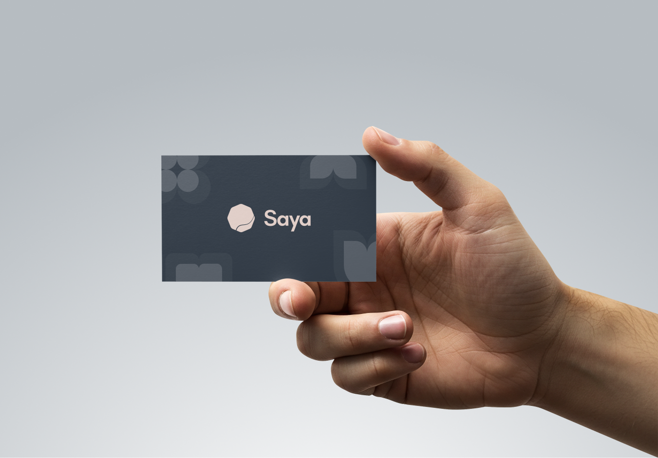
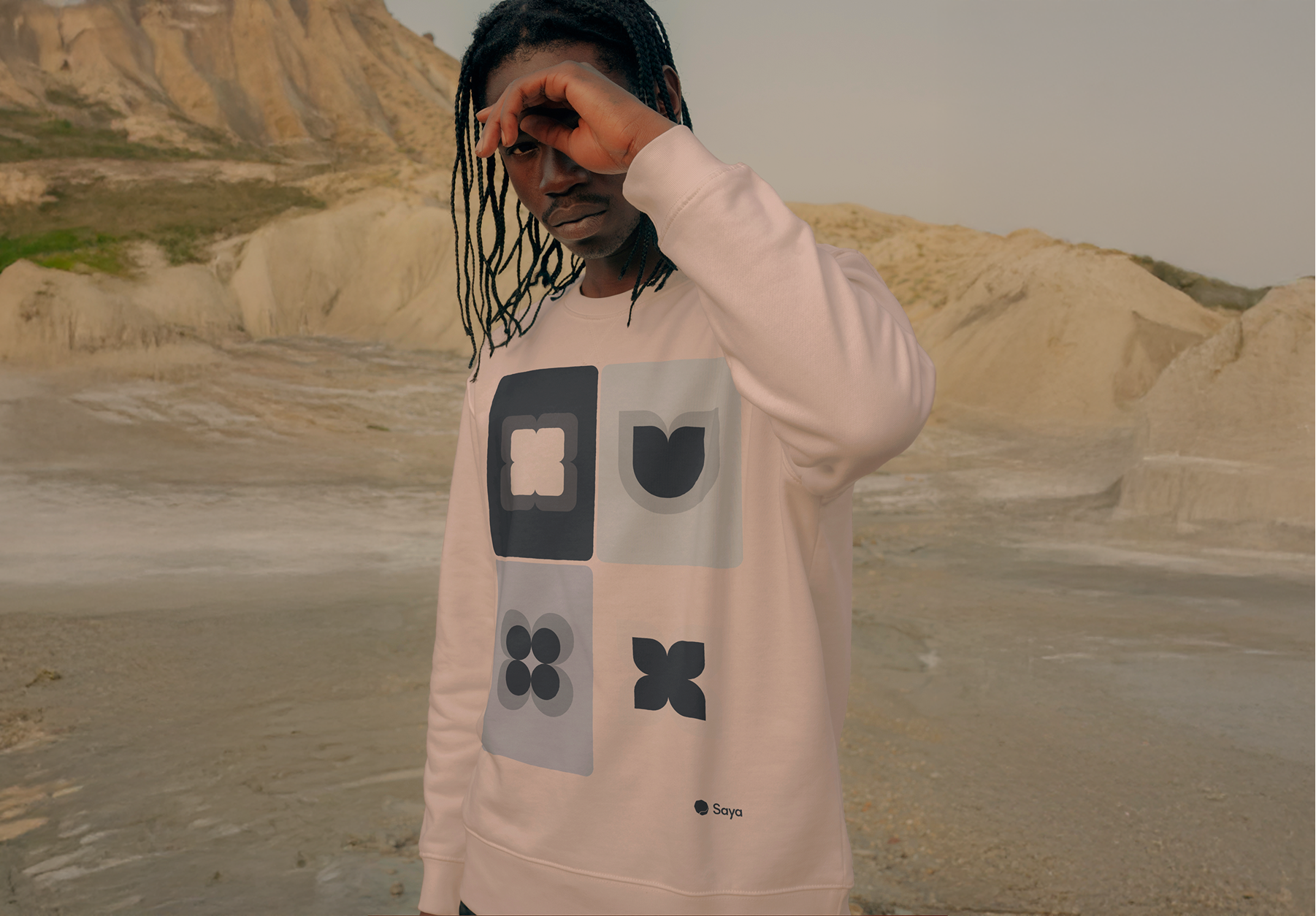
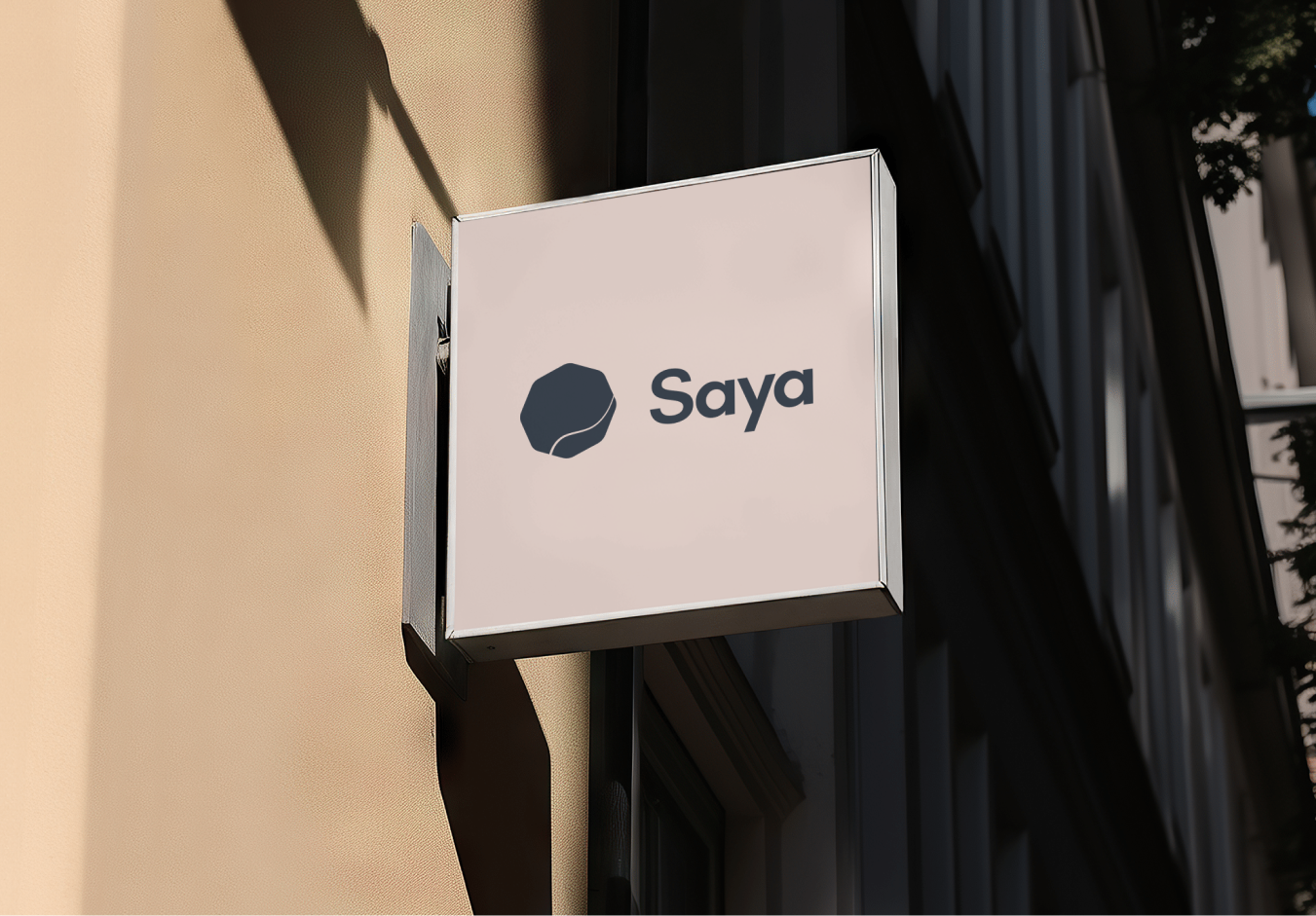
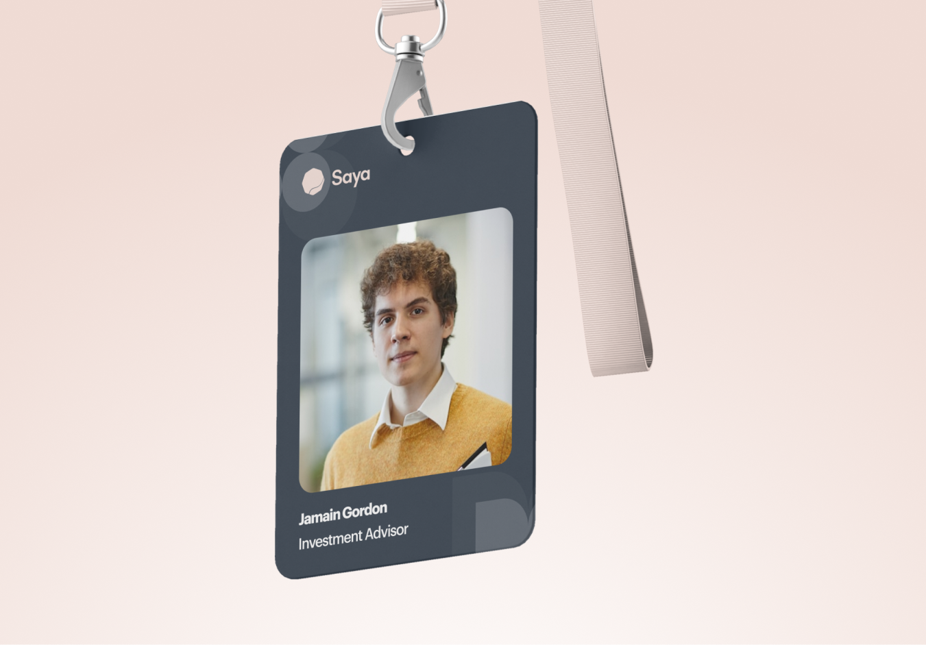
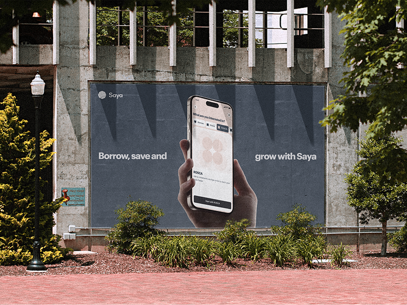
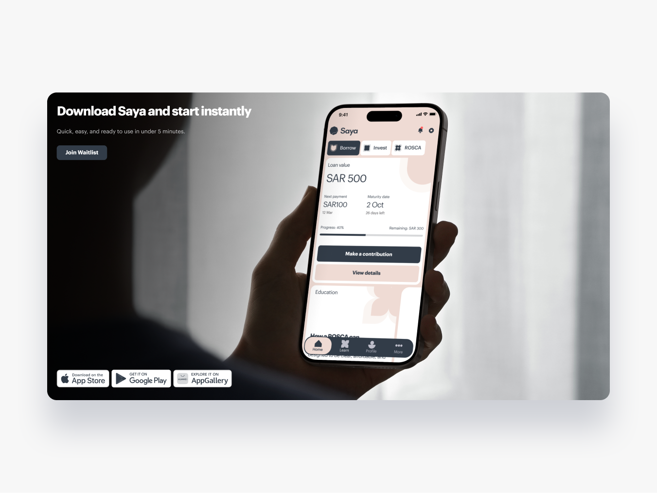
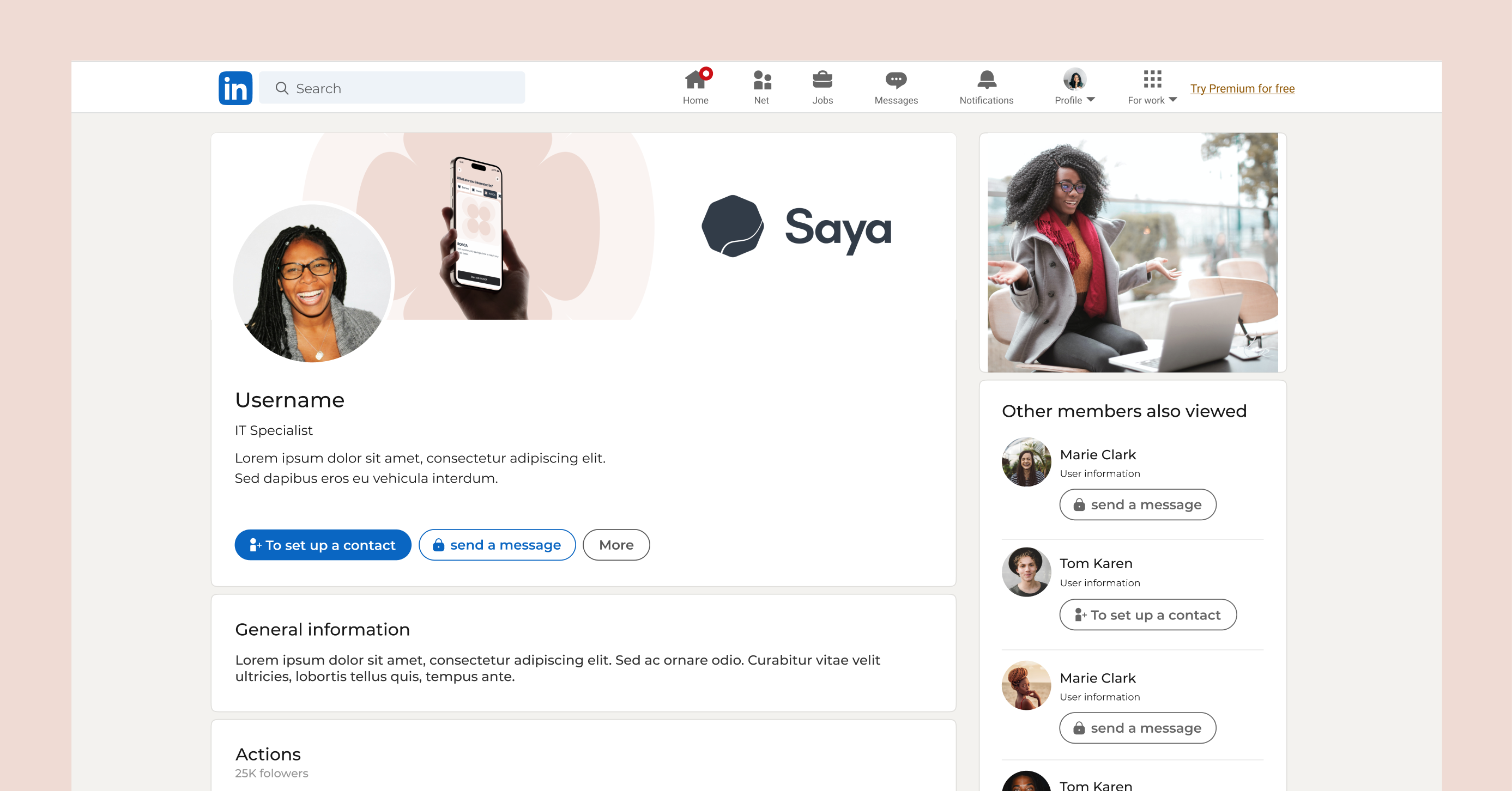
Application
This section shows how we’ve applied the brand guidelines to the website and marketing materials. From typography and colour palettes to imagery and tone of voice, every element was carefully aligned with the brand’s identity to ensure consistency. These examples highlight how the guidelines have been brought to life across digital and print, creating a cohesive and recognisable brand experience.